I found the dissertation to be enjoyable and relaxing to talk about. Due to
my love for film making, horror films take that love as well as that fascination
of the thrill of being scared and explore deeper into more of an explanation
and explore my own interests with the hopes of a newer outlook once the
dissertation was finished.
When I look at horror films, due to my interests leading me to do Animation
at university I’m more than familiar with the film making process and how while
I do enjoy myself when I watch a film due to my familiarity I do get taken out
of fully letting the film suck me into the worlds they’re building, instead I
focus on the camera angles and how the shot looks as well as being impressed
with designs of monsters or wondering how the animators/ special effects
departments managed to pull of the more action pact scenes.
This just means that it takes a special type of movie to really get me lose
my guard, which is both a blessing and a curse. Since if any writer has the
same mindset as I have it would be important to remember how to create fear, if
you are not scared then how can you be sure your audience will be scared.
Sometimes it is a leap of faith that your vision of what your fears will be
seen by others as scary, since not everyone fears the same things.
During my research I was surprised to see just how different a horror film
can be, with what I had grown up with knowing as a kid, that horror films were
nothing but blood and guts, deaths round every corner and monsters straight
from your nightmares. As much as a lot of these are somewhat true, there was
far more subtext and nuance to the story’s being told that I had not properly
understood till now.
Looking further into these types of tropes horror is so well known for doing
was fun and really got me to branch off from what horror normally was to me.
not to mention just how many complex choices a horror film must choose before
the final product. From learning more about the fear of the unknown and the knowledge
of the familiar and just how vast and complex these fears are, it is not just a
one answer question, there are sub answers and more questions that come from
those.
The complex answers that can be given to both the familiar and the unknown
when it comes to horror was a fun topic to try and dissect and I am happy with
my final thoughts on both being an important part to the horror film, but there
must be a common balance to both for the Film to properly function.
What this has done for me has really got me interested in focusing my
attentions onto watching more horror content, through books, comics, manga, tv
shows. To experience new horror creators as well as dip my foot into reviewing
more films, take more of a critique view of the content I am watching.
I love what I have done with my dissertation and I am hoping to be able to
continue this love of filmmaking further not only into my professional career
but also into my casual life.
This Download is a Power point presentation of what i wanted to do for my self led work.
Before L6 Notes (Self-Led-Project) The past two years ive noticed that my animations tend to lean towards weirdly looking creatures, with my Double act animation i feel being a really great for me Character design wise and i want to persue more character designs. With this i also want to dive into the world of horror, from the monster designs to the cinimatography and the storys that can be told i feel would be an amazing step forward to work in. As well as my love for both 2D and Stopmotion i want to murge both my animation loves together within this animation.
Monster Definition
1.A legendary animal combining features of animal and human form or having the forms of various animals in combination. 2.Any creature so ugly or monstrous as to frighten people. 3.Any animal or human grotesquely deviating from the normal shape, behaviour or character. 4.A person who excites horror by wickedness, cruelty, etc 5.Any animal or thing huge in size.
Change of Plans
So after The Group Presentations i was told i needed to focus my range a bit, since my idea of having three seperate animations tackling three different forms of horror, from Paranormal, Human like and Creature based horror that i should focus it down into one film. With that in mind im going to take a more literal focus and think about what i Find Scary. What is my horror?
What am i scared of? Normally with me i dont find horror films that scary, due to me knowing im not going to be harmed. I know its just a film and im not in this world. Im more interested in what the monsters would look like and if they’re cool, are the characters we’re following idiots and get killed in stupid ways? and are the kills or “horror” worth it.
What i am afraid of is a tad bit selfish but easily understandable. Its more of the fear of things happening to me. Its a form of compassion, feeling sorry for someone in a horror film, squinting at the sight of something hurting them or chasing them and feeling fear from what if that was you in that situation is terrifying.
Another thing i am scared of is myself, through depression, anxiety and the feeling of unimportance within the bigger picture. Its not just the fact that im me and i can only have a certain amount of time to do what i want in my life. but what if i fail? what if what im doing results in nothing? what if i dont manage to acheive what i want in life? what if i do and im still not happy? alot of what ifs and thoughts on my past, present and future. And the link to depression is something not only i go through and would be a good topic to dive into and explore.
What is Depression? Depression is a demon. Depression is a feeling of emptyness, a feeling of numbness, neather happy nor Sad. Depression waits for you at your low points and makes you feel lower you can hide depression from others but never yourself, you tell yourself that others wouldnt understand you tell yourself youre fine but depression makes you feel hopeless, depression is tireing. Depression attacks you whenever it wants, no matter where you are, no matter if youre alone or with people you care about, it will turn a good situation bad.
You want to open up with how you feel, But you also dont want to bother others with your problems, so you stay quite. Trapped in your own mind.
Character designing (MOSTER)
when it came to coming up with what i wanted from the monster is i wanted to take something familiar and currupt it to become something unatural and offputting. reason for this is the more you push something away from what we would call normal the more unsettling and offputing that thing becomes. An example of this can be seen in Phantom of the opera. where the Pantom is seen with a mask throught the play, we as the audiance are intriged as to what is behind it so it keeps our interest. and once the mask is taken off and we see the phantoms disfigurement, something unusual to what a normal human face would look like we end up being unsettled and uncomfortable with the view of the phantom.
The drawings i did focus on in the face i wanted to take out as much humanity as i could from the creature, only barely resembling a living person with the bare basic similaritys. i did this by trying to enlarge the mouth (give off a fear that it can eat you in one gulp) or remove the nose (lose the humanity) to shrink the eye size and make the eye socket distinct ( the eye is the window to the soul, making the creature feel souless and evil).
While designing the Monster i wanted to try out adding bandages to the creature. The reason for this is as humans we are naturally curious creatures, we want to know everything. So the idea of having the monster covered in bandages around its face and body was to see if people would be interested into seeing what exactly was underneath these obstucting items. Example. In Predator the alien is mostly shown invisable as well as wearing a mask, its not until near the end of the film does this creature finally take off its Mask to reveal something even worse. With the reveal it not only gives us satifaction on what it looks like but also we’re now more intreaged in seeing more.
I soon decided to scrap the idea of bandages due to me feeling the monsters face should be on full display, no hiding the horrors but putting it right infront of the watchers face. My new idea was to show off the idea of “Basterdisation of Perfection”. The idea behind this was how everyone has there own insecuritys and fears about themselves, such as there appearance and how they see themselves in the mirror, am i ugly? why do i look this way? maybe i can fix this with botox or plastic surgery. These things all lead into trying to perfect something that can infact course even worse effects and permanant damage to your own body. Things like stapling your skin to reduce wrinkles, unnaturally smooth and thin skin due to constant meddeling. Showing off to much gums with teeth due to trying to “fix” what wasnt broken.
My next phase was to choose the body shape and design and i went through many diverent veriants of having ether a skinny build or a big build. this was a bit tricky since to make the monster creey it has to as well be feared. which both body types can achieve put through different means. With body horror especially the more painful and damaged the human body looks the more offputting it feels for the audiance.
Final design and why i like it.
For the final design i decided to focus on both types of the body, with having a fat upper section with large skinny arms, with massive creepy long hands and fingers, in an almost dress like bottom. Reason for this is to me i find this massive creature with long arms being able to more easily reach out and grab you, with its bonelike fingers to be exactly the type of thing id call scary.
Character Design (Main character)
For the main character they’re ment to be a substitute for myself. What this means is when it came to designing the character i decided to focus on the face and to add some sort of cover to it. Reason for this is because the idea is to have mask be a visual signal that the character is ether hiding something or is preventing others to look at the real them. This can be due to anxiety and preventing others from seeing the depression behind the smile. Which is why i desided to use the box design. Due to Both its simplistic look and how its very recogniseable and visually interesting.
I really enjoy the box design, having tested out on a body type simmilar to me im starting to get used to the design. The character may not be able to show much emotions due to the mask coving it up, but through body language i feel it will become more easy to understand.
Here are some small scene testers i made to test out what scenes i can make within a bedroom, most of these items are found in my own student room, from a bed to a desk to a mirror. All different ways of how to express what i want. Like if my character is sitting at his desk or the character is lying down im just needed to find a visually appealing way to show off these scenes.
First Storyboard prototype
For my first attempt im happy with how the story goes. The story is how its been apart of my life for the couple of months, with the character being trapped inside while going through a depressive episode and how they ignore it till it becomes to much and it starts taking over, this is represented by the monster that will gradually get more and more impactful for the character.
These are some extra scenes i wanted to test out since the original i found some of the scenes to not look that great so tried out diffternt angles. While the second image is a new scene i was experimenting with which was having the charcter take off there mask but in its place we see a jumpled up mess of random face parts show up due to the character not liking the way they look.
Storyboarding First Attempt
With the first storyboard i added a repeat of the clock scene. the reason for this was because i wanted it to be shown that this was a new day each time, every time a depressive episode happened the day would end and an almost repeated day happens.
One added thing i was told to change was to add more exaggeration and shots to the scenes since they after a while ended up feeling the same and could be improved.
StoryBoarding Second Attempt
After the feedback i made this storyboard where i changed some of the angles as well as added some extra scenes with the monster since i wanted his presence to be shown more than the previous storybords. One of my Favorite shots i made was having the monster rap around the characters arm before a longshot of the monster forming into its body.
500 word (So Far) In the Viva Meeting I got the responses that maybe i should change the 2D character to 3D since the character is seen most throughout the animation, it helps keep with the model and would help lend itself way more with lighting for the scenes. While having the 3D character become 2d for more outlandish shots. This is something to consider since stop motion has the level of realism that would lend itself nicely within the real story of Depression I am trying to tell. But on the other hand, stop motion also hands itself very well within horror, having the Monster be stopmo with the lighting being dark with only glimpses of light would make the creature stand out against the 2D backdrops. Another argument was I was expecting to have the objects such as the desk, Bed and clock all be 2D, but if I Change the 3D character to 2D do I then also change the 2D objects to 3D or just leave them as it is. Definitely something I should think about. Possibly after I have finished my Storyboards so I am aware on what i need and what i should change. Another comment I am going to talk to heart and investigate more is to delve deeper into Depression, such as medical information, others accounts on the topic and even see into organisations and charities, this is due to me only focusing on my own thoughts and experiences and as well and good that is, it’s also important to check out wider viewpoints and with this added knowledge it would help out my understanding on what i want to create for my animation.
Final StoryBoard
For the final storyboard i edited the phone scenes because i was told that looking at phones or a computer and other tecnology that tends to look boring, so with that i changed the scenes slightly to add more interesting looking scenes. I also edited the ending a bit to look more dooming for the character leaving the story on a more sad end, since most endings within films and tvshows are happy ones and id prefer to deviate from that.
Animatic
Animation styles and Inspirations
While in the meeting i was asked about working within 2D and 3D during the time i thought i would be able to work from home doing 3D work, this unfortunatly wasnt something i could have done. So with the knowladge i would be focusing on 2D i looked at films, animations and scenes i loved that would influence my work.
With films i looked at old horror films such as Psycho (1960) and Frankenstein (1931) due to there use of camera angles and the use of darkness adds mystory to the films. Im also a big fan of the simple gray colour sceme, makes the whole films seem washed of life and adds more to the spooky tone of the films, whas that a monster of just a shadow?
while with Animation i looked at and found love were by a youtuber named Mamamax who made these simple but really stylized animations where he would talk about a topic in a melancholy and sad way which really added to the videos he was making. With titles of Ugly, Lonliness, Depression et cetera, you can see he dives into some hard topics which im a fan of viewing.
The other Animation that hits home for me was the animator Don Hertzfeldt. Now ive known about him for most of my life due to his REGECTED sort which dived very heavily into Dark Comedy. While id like to take a look at his more serious work with the film its such a Beatuiful Day. In this film it talks about depression, loniness and the ever present longing and hopelessness of the universe, lets just say i was hooked throught the film. From the animation making everything seem claustrophobic to the simple black and white colour scheme before hitting you with something important fully in colour is very visually pleasing.
Thoughts so far.
So Far im Pleased with how i am doing and im happy with how my animation is coming along. But to take things back a bit with all that is happening due to lockdown and covid everything started to feel exactly how i was doing in my animation. I felt this mind numming fog loom over me constantly and with no one to really talk to in person it really had a negative effect on my mental health. This is why i wanted to make this animation to in a way, put what im feeling to some sort of understanding, maybe some closure, but mostly to be able to show and express my feelings out to everyone else. Doesnt matter if no one else understands or even knows what im talking about. Just the fact im putting this small bit of myself out there is more than satifactory for myself.
Final Animation
Final thoughts
With the animation done im happy with how its turned out. I enjoyed using fifferent shades of white, black and gry to create a dismal, unhappy setting. I thing think the small uses of colour adds alot to the scenes they are in really emphasising that these are important. Finally while animating i decided i really disliked the ending. I know i said previously about wanting a more bad ending, but then i realised that within horror its always best to leave things up to the imagination. So by the half way point i dropped the ending, and left it more at a cliff hanger. leaving it up to the audiance to decide how the story will end.
The three different groups i feel interested in working with would have to be Ash Wales, CANU and Games Design.
All three would help me improve my 2D animation skills as well as help me learn more about Rigging and animating a skeleton, essecially in CANU, being linked with S4C having a company like that being put on a CV would be amazing to have. While working with ASH wales having the freedom to create my own animation with small inputs here and there to refine the work for the company would also be freeing, unlike CANU which would be more teamwork based and less creative and more straight forward animating a pre existing template.
Witht the Game design work im interested in it because i normally do play a ton of videogames, grom shooters, to horror, to fighting and platforming games, having the knowledge of games would help create sprites or work alongside game designers to create a more visually interesting video game.
New Thoughts
After chatting with each company and group ive desided to go forward with working with CANU and ASH Wales. Both are going to help me improve my 2D animation skills while CANU will help me more with Rigging and working within a group.
I desidend however i will not take things forward with The Game Design group, this is due to me mostly being stuck making concept art for the characters or monsters they want me to make. This isnt a bad thing however since working on concept art would have helped my skills. but i feel i wouldnt be able to fully take advantage of being able to animate for companys if i dont animate and improve my animation skills.
Ash work
This slideshow requires JavaScript.
When it comes to The Ash work i wanted to keep things visually interesting and different. Instead of focusing on a single storyline i wanted to keep with the info Ash gave us. I wrote down a suitable order that would work for a consistant timeline for different impacts a Cigarette butt can have on the enviroment.
I then created some designs and visual look i wanted to create for the ad. I desided to take an idea from my last project which i used crayons to create a childlike looking designs. with this in mind i desided to make the animation appear like a chalkboard while the designs appear very cartoony and use a chalk style which i beleive felt unique and distinct looking for an advert.
CANU work
For the CANU Work we were given, Scripts, audio and Animatic Photos to be put into Adobe Premiere Pro and editited together to create a working animatic to be sent off and reviewed.
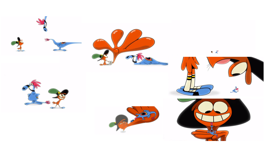
My animatic was Episode 4 , Aderyn Melyn which had 3 different birds, yellow, green and orange, while a different tree was shown alongside the bird, Banana, cucumber and Spagetti.
Matching the audio with the pictures reminded me of when i worked on my Visual music project and being able to link up the animatic while reading through a script was really interesting and i enjoyed being able to read through and understand how the script wanted for each scene.
Working From Home = WFH.
So After word about the Corona Virus being announced and we being unable to work in uni most of what ill write about is the amount of work i can acheive at home.
ASH (WFH)
Luckily with the Ash animation i had managed to get a Copy of TVpaint from Morgan which could last for 30 days. In that time i managed to spend all my time animating as much as i could for ASH.
I had managed to get every single scene done as well as keep with the designs and theme of a Calkboard alive.
But unfortunatly i was unable to fully finish the work. due to being unable to add Text to the animation and fix a small flicker in animation i was unable to spot while i was animating.
CANU Unfortunatly i was unable to really continue animating the animatics that were given to me due to my tec at home being unable to properly download or use the software due to my home interent and my computer power.
What i was able to do however was help with the shot and panel numbers to the animatic. Due to my own computer it felt like each time i tried to do this for CANU another problem would happen. From 1/3rd of the last part of the animatic wouldnt load properly so i had to readd the scenes. to the audio glitching out and me having to replace it. as well as it not being able to save properly. But that can all be placed on my computers power as well as my home interent not being able to achieve what was needed for this project.
Luckily however i finally managed to finish and ass the Shots and Panel numbers into the animatic so even after all with what could have gone wrong did go wrong im lucky that it managed to happen now, so i can remember this for next time and know what to do when something like this happens again.
ShowReel
Conclusion (500 words)
Throughout this Project there has both been ups and downs with both Projects as well as an unexpected virus changing up plans and how i was able to compleate my work and how i managed to adapt to acheieve the work i had achieved was an interesting adventure.
Im happy with my choices with working alongside ASH Wales for the freedom to achieve what i wanted while sticking to the ideals that ASH Wales want to advertise. While CANU was great to work more inline with a company and being able to read through scripts and create animatics with audio and images given to us was a great expirience to learn within a company setting.
But with all the good i think the improvements that need to be adressed is my equipment at home. I was able to use tvpaint for a short time but after the time limit i was practically useless when it came to finishing the ash work. The same with me being unable to use CELaction for CANU so me being stuck doing animatic work.
With this i decided i need to focus my efforts in working on software i am not used to so im able to at least keep busy and learn to work with more softwares that companies could be looking for. I have been learning how to work within Blender and Adobe Animate, since both animation software are able to run well on my computer and are two software companys are also seen to be using.
What this means for L6 is with the subject being my own work i wanted to dive more into my love for Horror, after doing my Dissertation prep on what makes horror films inflict fear for an audiance it really makes me ready to create something within the Horror Genre. This at the moment would be concept art, me looking into popular and cult classic horror films, games, books and researching what in those specific mediums make the monsters scary. This could then lead to me creating character designs, small walk/running cycles of the creatures and just brushing up my 2D animation skills within Adobe animate and Blender.
This can then lead off to me creating a short animation story with the monster, possibly working on script work and animatics for a sort horror story. when we go back to university i can work in stopmotion and create my 2D monsters i like into a 3D creature, due to my understanding that Stopmotion monsters, appear much more terrifying than CGI or any other form of animation. Which would work beutifully with my Horror monster creation idea.
ANIMATION BREAKDOWN. 18.02.20.
STATE OF THE NATION…… Animators dealing with contemporary issues.
Before I start, I want to push my views on the videos we have seen but for some I will talk more about their messages, animation techniques or things I agreed or disagreed with their messaging.
Marcus Armitage – My Dad
Armitage’s work within this animation is chaotic and vibrant with colour. The use of sound within these scenes gives life to the world he is creating, music being played, people chatting, cars beeping. He creates this world full of life and people together. Then he flips back and forth when he talks about his dad, every time he talks about his dad or something his dad has said to him, you see nothing but black or white. He talks about immigrants and jobs being taken. This to me is trying to show that the views of the dad are black and white, very right way or the wrong way. And the use of the newspaper ripping apart all the colour from the kids’ point of view is a representation of the kid starting to believe what his dad was talking about and making him just as negative about the world as his dad is. I really enjoyed the use of colour and sound within these scenes. I believe these were of a representation of how if we cut out groups of people or cultures that are not our own, we lose more of that colour and sound we could be experiencing. And the use of it slowly disappearing when more and more newspapers keep making things black and white creates a cold and colourless world to live in.
Lisa LaBracio – The Opposites Game
While the animation is basically just doing exactly what the story is talking about, I feel that it takes that and makes it as creative as possible. Reason I say this is how they use stop motion for the book while they use hand drawn animation for everything else. The use of cutting the paper, rolling them up into balls to represent kids fighting, puppetry. The full amount of uses the book could give is being used to its advantage. The story I feel is an interesting take on how people view things differently. What is the opposite of a gun? No matter what answers they gave, each one could be right, but due to others believing in something differently they call those answers stupid. Each one thinking they were right results in them separating and going into their own groups, they become an echo chamber to themselves, never being able to discuss or conclude together. Reminds me of other topic where it becomes a laughable shouting match between people thinking there right and fighting anyone who would disagree with them. Religion, politics, personal interests and ideals each one could be used as an example of the message this animation is trying to show.
Donato Sansone – Journal Anime
The use of colouring on a news paper reminds me so much of school and my childhood. Anytime we had a lesson with books we’d turn to a page and see graffiti all over the school owned books. funny messages added extras that didn’t make sense. Random drawing that mean nothing and was only there because the drawer liked it. Sansone’s work reminds me of Marcus Armitage’s Previously talked about animation, My Dad.
The use of creativity while this person is bored drawing random things that don’t make sense for the scene like tentacles on a building or the Simpsons being put in a burnt down house. Its sporadic in nature due to how crazy this guys mind works, the more he see’s the more you see his mind goes to when he sees those images. Sometimes you’ll notice these small moments where when he does care about those topics its dark and scary imagery being shown, from people in balaclavas holding a knife, politicians with big stacks of money and Hitler becoming a millennial teen. While we see when he’s not interested it reverts to something silly such as ghosts being arrested, and astronauts being eaten by the moon. We’re essentially looking into the mind of this man; we can agree and disagree with if his views are right or wrong and if he should care more about certain topics more than others, its his opinions, and I feel the way Donato Sansone showed us the way a mind would work to be exactly how id imagen a mind coming to conclusions or just random thoughts.
Beth David and Esteban Bravo – In A Heartbeat
Now this animation is very reminiscing of Pixar level quality within its animation. For a short college film this is exceptional. From the lighting and colour schemes being bright and vibrant in pinks and purples compliment this short very well. Even the character designs are simple but are easily recognisable from each other.
But in my opinion the story feels done to death. A character loves another but can’t find the will power to do it. Then something happens that brings those characters together (this being the boy’s heart) and then by the end those feeling are resolved. Does this make the animation bad? No not at all, but the story does feel like its been done before.
Now what the film does have that changes things a bit would be the inclusion of the main characters being gay. This was a big draw for many people who watched it. Getting it wide acclaim and recognition from millions of people. But I don’t agree that just by adding an LGBT character immediately warrants praise. It’s important that representation is shown, but the idea that a film is only good solely on that representation I feel is shallow. That to me isn’t the films fault. This could possibly be due to, at the time, how uncommon gay characters where shown in animated films. For me I feel that having a character who is LGBT shouldn’t be taken as highly praised as it should, if you want people to have LGBT characters in films become normal and treated the same as every other relationship, don’t treat it like a spectacle when it is shown. Otherwise it won’t become normalised. But again, that’s not the films fault, it’s the people who look to deeply into this type of issue.
Animation Breakdown. 25/02/20
Manivald. Chintis Lundgren. 2017.
I really enjoyed this animation. If I had to pinpoint, why I liked this animation compared to the others that were shown. it would have to be due to the use of awkward silence. Throughout the animation we’d be met with these perfectly timed awkward silences. Normally these silences would be used sparingly and mostly used only at the most awkward moments. Manivald however uses the act of awkward silence throughout.
The reason for this I believe is because of the Mother and Manivald. It is shown early on that she is shown to be very possessive of Manivald, thus making Manivald more introverted as well as unable to stand up for himself. This is shown near the beginning when Manivald is playing on his piano and sees a parade playing. He then copies them before immediately stopping once his mother stops him, showing a clear fear and influence his mother has on him.
I noticed a clear use of music was very prominent as a distinguishing factor with this animation.
Whenever its just him and his mother its silent and quiet, leading to the awkward silences. But once he’s alone or with someone other than his mother, suddenly there’s music. This is especially shown twice within the animation. Once with the Plummer while they’re in Manivald’s room away from his mother and the second time is when he’s left her and starts playing happily with the Parade band. On another note, when he is playing with the Parade band he first starts playing the song his Mother wanted him to play, so its starts off sad and upsetting, before he suddenly switches into a more joyous version of the song, showing he is now free and on his own away from his mother. While the last time we see his mother she is alone, without music and has an awkward silence with a moose. Showing how She is now miserable without Manivald.
My dissertation i wanted to talk about what i previously talked about which was “why is Stopmotion unsettling” the reason for this is because of my fondness over horror films and animated films such as Nightmare before Christmas and Coraline.
i managed to go into great deal about what exactly makes stopmotion scary. Talking about how stopmotion started, using bugs and clowns which are already scary things to people, how stopmotion was used in films, such as terminator and class of the titans. Then i went into more sientific research discussing the uncanny vally and why it helps my research explain that the more something apears real the more it becomes uncanny and offputting.
So with this already gathered information i discussed already and found an interest in i thought i would just continue my investigation on this chosen topic.
WHY IS STOPMOTION UNSETTLING.
This was brought up in our first meeting in groups where we spoke about our ideas and came up with why we would want to talk about it, explain a little about why we enjoyed this topic.
Afterwards i started to focus on the idea of the word unsettling. what do you have to do to make people scared? why are people afraid? what is it that makes something scary?
This lead me down the road to watching Nightmare on elm street and Jaws.
The reason for this is because of my interested in horror and the idea of scaring someone, i wanted to watch films i am a fan of and find out why the scares work so well.
while researching i looked for stop motion monsters. The information about horror films and Stopmotion i looked into scenes such as a stopmotion Freddy Krueger in the film A Nightmare on Elm Street 3: Dream Warriors. where Freddy becomes a Stopmotion Puppet. Other films would have been Class of the Titans with villians such as Medusa and the kraken and Evil dead with the stopmotion used for the demons death scenes.
The reason i want to talk about stop motion so much is due to how realistic it is compared to CGI, with stopmotion the movements are more realistic and offputting due to the uncanny nature of how the lighting, movement and textures on the creatures are eerie and unsettiling compared to CGI which feels rushed and unfinished, the creatures normally feel out of place and plastic looking making the audiance who watches them feel less threatened by it due to them being taken out of the moment, knowing its fake, unable to make them disbelieve.
After more meetings i realised with my love for Horror and my interest in what scares you. I think im going to change my dissertation to more about film than just stop motion, reason for this is because stopmotion is mostly seen in older films all the new information i will be able to find wouldnt be up to date. So i will still try to stick with stop motion, but i will group it with Practical effects.
Practical effects is essentually when the items and objects used are real, this can be from guns, creatures, monster costumes and sometimes special effects. This gives off a much more realistic feeling to a film but due to costs more and more films decide to go with CGI to save time and money.
With this in mind this fits with stopmotion since both “relecs of the past” have been replaced with CGI, which i dont feel is right, esspecially for horror films that need that extra realisum.
Now that ive decided to focus more on Practical effects i will also be changing the link from stopmotion horror to just Horror. I will do this by having the main focus of horror i will talk about films that have sequels or remakes based off them. the reason for this is normally with horror films, if they get popular they will get sequals but due to Companys wanting more money from those sequals they reduce the money to make it, leading to CGI being used instead of Practical effects to help save time and budget.
Films that follow this trend can come in many shapes and sizes from Nightmare on Elm street (Used stopmotion) but its remake uses CGI instead which looks outdated, The shining (Steven king hated the original so made a TV Series which uses CGI) Jaws ( Jaws 4 being the most hated, with one of those reasons being the abundance of CGI), Al, en (original using no CGI compared to the most recent film soley using CGI), The Thing original used nothing but practical effects while the prequel was going to be practical but the studio at the last minute edited the film to make it CGI.
as you can see there is many many things i could talk about. so to focus on the important infomation i will talk about films, what makes them scary and why they are able to be scary. I will probably be talking in deph about cinimatography, music and sound since all three are able, when working together, to create the sensation of fear.
Im happy with my choice to focus more of horror films and why they’re scary compared to just Stopmotion films.
I feel i now have a much wider range of films i would be able to pick and choose to talk about and i cannot wait to be able to talk about them.
Books I researched
The Stop Motion Filmography Volume 2
Neil Pettigrew foreword by Ray HarryHausen
Page 503 – Nightmare of Elm Street 3 : DreamWarriors “The best of the series was Dream Warriors, which had some superb special makeup ‘effects and also two sequences that used the stop motion skills of Doug Beswick and Jim Aupperle.”
Page 504
“Beswick, Aupperle and their team supplied 23 stop-motion cuts. Five are used to show a foot-high marionatte of freddy comming to life.”
“The Marionette sequence begins when a featureless string puppet hanging on a wall transforms into a likeness of freddy”
“The Puppet slashes its own strings and drops down, landing on the floor (a miniature set) on bendy legs that are deliberately unrealistic, and walks towards the bed”
Page 505 “In five medium shots (two from the front, three from behind). The skeleton advances on wasson”
“Two superb long shots, angled as if looking up from the grave, show the skeleton shoveling earth straight at the camera.”
Horror and the Horror Film
By Bruce F. Kawin
Page 2 “Horror can be filled with violance, cruelty and gore. It can scare us badly. It can be inexpressible, nameless. It can make us want to vomit. And it can be disturbing”
Page 3
“Above all, the horror film provides a way to conceptualize, give a shape to ahd deal with the evil and frightening”
Page 5
“Our eyes widen at the image of Horror, Taking it in, Feeling awe at the awful.”
“Those Moments – When we must look at what we dread to imagine or think we cannot bear to see – are the pulse of the genre, moments of revelation and clarity”
Page 7
“One of the first things to examine critically about a horror film is weather it depends more successfully on spectacle or on suggestion.”
“What cannot be shown must be implied, and much of the art of the horror film has developed as a means of suggesting – in shadows for instance what might be hidden in shadowns.”
The spectre of sound : Music in film and teveision By K.J. Donnelly
Page 1 “Consequently, i am concerned with how film music constitutes a system of control basedon is ability to affect audiances in a significant manner and to assent to or validate their emotional reactions”
Page 22 “Film music’ haunts’ films, both as ghostly references to somewhere else and something else, and as a mysterious demonic manipulative device.”
Page 23 “Illustrations of this ‘Demon’ could include the shark theme for Jaws (1985), which indicates the offscreen presence of the shark as a powerful musical presence”
I found the museum experience to be really enjoyable. Being able to get out of the classroom and being somewhere completely new and full of so much cool interesting items was a delight on the senses.
While we were all walking through the painting section and looking at all the old portraits I for some reason cared more about how extravagant some of the frames that were used for the Paintings. It felt as if the frame was just as much a part of the paintings as the actual work of art. Which is why when I took the photos I made sure to focus on the frames more than the paintings.
I really enjoyed looking at the old fossils and skulls, it really gives me the appreciation of how complex and detailed every single creature is as well as see all the details we would never have seen while they were alive. A bit morbid I know, but seeing each bone fit in place and being able to see how those animals would walk or move just from there bone structure is always something that intrigues me.
Dinosaurs for me are one of the most interesting things to know about. Almost mythical in nature it’s amazing that creatures like this actually exist. The mystery behind them as well is so intriguing, how did they die? What did they look like? Do they a have feathers? All questions that keep getting brought up due to how interesting and still unknown these creatures are.
I enjoyed this little exercise, since I haven’t worked with animating on paper in awhile it was nice to get back to basics and see how far I’ve come from last year.
Each had their own little problems that I had to overcome and figure out the best method of animating them.
The first animation having it move was really fun to see it come to life, but the struggle of the lighting continuously changing while I’m drawing made me get all the information down as fast as I could. Which was a fun exercise.
The second animation was of a still fossil so I had to use different drawing styles to show off the look of the fossil that couldn’t move. I found this one to be the hardest since I had to make the same image without moving the fossil while also keeping in mind each page had to look different.
The Third animation was merging to exabits together which was a real fun time seeing my first few pages morph into the other was a real fun exercise I never really did before and id love to do more with that.
What I want to pursue and what ideas do I have?
When it comes to what I felt more emotional towards while I was in the Museum, I would have to say it would have been the Dinosaur exhibits. Millions of years, evolution and research have gone into learning more about these almost Mythical creatures. Something like that really makes me want to pursue more about these dinosaurs.
As an animator my first line of thinking is to create an animation based on those dinosaurs. Using some of the dinosaurs that were seen in the museum, like the Draco Raptor or the T-Rex.
The ideas I had for animating these would be things like gaining toys from toy stores, my childhood toy’s or asking for my nephew’s toy dinosaurs and animate them living there day to day life.
Another idea would be for me to continue my interest in Stop motion. Grab some clay and create Dinosaurs and create an animation of them realistically moving, running and walking.
Research
I really love the character designs of these dinosaurs. They’re simple with their colour schemes and their designs are recognisable as well as the simple clean story telling makes this animation really stand out. Plus, for me the little added bits of comedy really help this little animation give off something you’d see on a Saturday morning children’s show.
Both animations to me are so charming and cute. The level of detail on how the dinosaurs move and act brings so enchanting wonders for me, seeing these cute tiny clay models of dinosaurs, even if they’re not necessarily realistic. Just the fact they look close enough to a dinosaur, with added noises to push that further, really makes me enjoy them even more.
While I took those ideas to our first meeting and I explained my ideas. This led on to people giving me ideas, since I focused quite a bit on how when I was a kid, I really liked dinosaurs. These ideas led onto me thinking on focusing more on the fact that kids tend to almost instinctually be interested in Dinosaurs. So, me focusing on both dinosaurs and how to be able to target kids and their interests.
My first idea was to create sock puppets of dinosaurs, this was fun to design and come up with different ideas, felt like I was creating my own Muppets. Coming up with if I wanted them to be furry or how to represent their eyes or teeth through things like Ping-Pong balls or cardboard.
I decided however against this since I don’t feel confidant enough to have properly produced these creations, since I’m not at all confidant enough to stitch or sew.
My Second idea was of how kids’ drawings were essentially there starting point at creativity and art. Plus the knowledge that they love dinosaurs was something I really wanted to explore. So, my idea was to create childish drawings as similar as possible to what kids would normally draw. I had a lot of fun messing around with shapes and colours but unintentionally I was creative while I was doing it.
My third idea was having cartoon dinosaur characters while I create a small animation of shorts. The idea for this was how kids love to watch cartoons so having a cartoon about dinosaurs would be something they would love to watch.
My Proposals
Proposal 1
Overview
Creating stick puppets and then creating a short film with a basic story about Dinosaurs. Items Needed
Paper – Could use book paper or Card.
Sticks – Wilko
Glue – Pritt stick or Tap
Colouring Pencils
What Has To be made/Collected
Pre Created Dinosaur designs
Background
Camera and Camera stand
Final
I create my own Dinosaurs that appear to look like childrens drawings. I then create a simple story using those puppets.
Proposal 2
Overview Gather all the equipment needed to have kids create there own Dinosaurs and then take those designs to create puppets. We then film their results.
Items Needed
Paper/Card
Sticks – Wilko
Glue/Pritt Stick/ Tape
Pencils and Colouring Pencils
What has to be made/collected by me
Background
Camera and Camera Stand
Final I give kids the equipment needed to create there own Dinosaurs and create there own puppets. I record them making their own storys in groups with their designs.
Proposal 3
Overview I create a short animation using Dinosaur designs that kids would love to watch. Like a saturday morning cartoon shows.
Items possibly needed
TV Paint
Paper
Coloured Pencils
Clay
Camera
Lights
Background
Final I create A really simple animation of Dinosaurs but in the style of kids drawings.
This would look crude but have a childish, almost charming look to it.
What Proposal i have Chosen
I have decided to focus my efforts on Proposal 1. The reason for this is because I have already practiced creating characters while pretending, I was a child, drawing. I feel that this idea of making my own puppets both take my sock puppet idea and my child drawings idea and organically place them together. Since I’m unable to use the idea of proposal 2 to be able to get actual children to create the drawings for me, since I don’t have the resources or skills necessary to do this. Which is why I feel my First Proposal would be the best choice of action to continue with.
These were my final ideas for my dinosaurs.
I found it difficult to keep a balance of childlike drawings and keeping my own artistic skills supriessed to not make them feel unchildlike. But by the end of it i feel ive been able to have a good balance to show a childlike drawing style with just a hint of my own knowladge to at least keep the designs recogniseable as well as make them distinct from one another.
This slideshow requires JavaScript.
This slideshow requires JavaScript.
This slideshow requires JavaScript.
While i had finished the designs i still had to come up with what colours i would use. While designing the colours however i had to stick to how kids would normally go about colouring a picture. The answer to that is that they would both do it randomly as well as inconsistant. Maybe they’ll get bored colouring and leave massive gaps of uncoloured dinosaur, they’d go out the lines, something me and other artists have now been prone to avoid. They also would have little to no understanding on colours and just use whatever colour they want, even if those colours dont work together or are typically assosiated with that dinosaur.
While colouring i had a lot of fun, not caring about all the basic fundamentals ive learnt from designing and colouring characters. It was like i was going back to when i first started off my life drwing. It was a plesent expirience and i was suprised how much i got invested at just colouring randomly.
Unfortunatly however while i was colouring these i realised that colouring them on Photoshop with a crayon texture i realised it didnt feel real to me. It felt more manufactured and fake than if i had done it with actual Crayons.
This is why i went out and bought actual Crayons to fully make my colouring feel as real as possible while coming up with what my Dinosaurs would look like.
This slideshow requires JavaScript.
I feel that actually having the dinosaurs in crayon really shows off a more natural look for the designs for them. Each mistake, harsh colours and randomness put together i feel brings the whole piece together.
Final Thoughts Throughout this project I feel like I was reliving a part of me I haven’t felt like for a while. The excitement of seeing all the different fossils and skeletons as well as having a newly appreciation for everything within the exhibits as an adult show both my growth as a person and how far my interests have changed and developed.
For my work I realised a great interest in the idea of having more interactivity within a museum space. The reason for this is how on the first week spending time in the museum I noticed a lot of kids running around the Dinosaur exhibits and trying to touch the fossils, even trying to clime over barriers to get to them before there teachers could stop them.
I liked the idea of gathering the items that kids could use to express there own creativity through creative and interactive methods.
When you’re young you tend to be told not to do that or this is the “proper” way to do something. Over time that becomes normal and you normally don’t go outside that line of “proper”.
Which is why while I was designing the dinosaurs and colouring them, I had to go back to the beginning of my creativity. Through going back to my artistic beginnings, I realised just how much creativity we tend to lose due to being brought up being taught how to do certain actions. From colour schemes and what goes better with what, to staying in the lines when drawing a character. In a way we try to improve and get better at drawing things perfectly that in fact, just ends up as us becoming less creative and more prone to sticking into our own line of thinking due to our upbringing and how we were taught at a young age. Which stops us expressing true creativity.
Before starting Figurative Modelling, I wanted to be able to improve my knowledge on the human body. Plus, with there being able to attend regular life drawing lessons I was really looking forward to improving my skills within the human form.
Using clay was something I haven’t done since comprehensive school but I managed to get back into the groove with it, and with my new found skills within art I feel like I have improved my skills within Clay again.
This has given me some ideas within animation, especially when we created the clay hand, I can make an animation based on something along those lines, since I had a lot of fun making the clay hand as well as how much a hand can be animated.
If I had to say one thing that I think as an experience Sewing was something, I was hesitant to do since I was worried if I ruined it id must restart from the beginning. So, I feel like sewing isn’t something id be interested in perusing.
for the final group project, I was really pleased with how it turned out,
I liked being able to work in a group as well as bouncing ideas off one another, seeing different viewpoints, and coming up with the best final product.
Overall, I feel that Figurative Modelling has helped me gain a better fuller understanding on the human body, especially with Life Drawing. The constant rough sketches I feel helped me not care about the final product but helped me gain a better understanding on how to get the most important and basic parts of the human body.
Mark Making
This slideshow requires JavaScript.
I really enjoyed creating different textures with clay, pens, pencils and Paint. noticing little details you wouldnt have if you didnt focus on looking for those textures was fun for me to notice.
One of those textures that i noticed would have to be the unintentional marks from the clay that would stain the paper we used. I noticed those stains and it made me think of it as we always leave our mark on people even if it was unintended, how you acted and what you did with them leaves a mark.
Sewing Arm
For a first time effort with sewing i felt that i did a pretty good job with it. being able to use a sewing machine was complex but fun to learn how to use. this was then filled with plaster. I found that adding the plaster was both fun but a tad stressful since i wasnt quite used to using that type of material and the timeframe to make sure it doesnt harden before i could finish.
Sewing Foot
Just like the Arm im happy with how ive sort of got the hang of sewing, especially now since i tried to create a more 3D foot.
Head
Firstly i wish i took more photos of before i got around to the general head shape i made.
But other than that i am happy with what i have created. getting the head to appear humanesque as well as putting in the facial features correctly but somehow makes the head appear not as human as i wanted and more like something trying to replicate a human and doing a horrible job in doing so.
Clay Hand
Honesty i cant even beleive how well i managed to create a hand. Normally when i draw hands i cant seems to make them look like them, but with clay somehow it was way easier. For a first attempt i think i hit it out of the ball park. if i can replicate this in my animation work id love to make an animation with clay hands.
Slab and Slip Mug
The slap work i found to be a bit too abstract for my liking. i felt that it was a little confusing and that putting them all together a little randomly made the object look like a bit of a mess. But the positives i found when doing this was working in a team and talking to each other about what to add and where to add our different slabs. as much as it is nice to work alone on my own artistic works its also a wonderful to just chat with and gain ideas from others and was a nice change.
Final (Bringing Objects Together)
The final group work i found to be really fun, being able to work as a group and use our items that we made throughout out time in feild was an interesting exorsise.
One of my favourites was the Black glove i noticed from the start and i thought to myself “i have to dunk that” so after i went ahead and dunked the glove into the mix and i hung it up it gave off a really nice patchy effect, like a rorschach test on an arm. Plus having all the white be mostly located on the lower part of the arm while the top being black its like a juxtaposition of heaven and hell where we’ve always thought up being light while down being dark.
With my Ideas I just wrote down whatever I found looked visually interesting and stood out. I decided to not create a storyboard for my work this time because since I would be creating a music piece with the music being my storyboard I wanted to focus on what visuals I could achieve with the audio to get a much more authentic, in the moment, creative animation.
What Song have i chosen?
I’ve decided to use the song LEX by the band Ratatat. The reason for this would be that compared to “For River” and “Monody” which are slow and have a big build up. Ratatat Jumps right into the song and keeps a steady beat and melody the other two just dont have. And as much as i like both songs they’re both very repettative.
More song animations ive looked at
The use of colours and mood of these animations i feel give off a very errie vibes within it. Especially the first shot, with the centure being the only sense of colour while the background is just plain darkness. I like this visual alot and may keep this thoughout my animation and keeping with that Errie vibe.
While the other animations ive looked into were good i feel this is more the sense i wanted, having each part of my animation hit in time with my music to give it that extra punch is what i want from my work. and this animation does it pretty much perfectly.
What will i be animating?
Due to LEX having a very robotic sounding beat to it. I decided to focus on that factor with my animation. Due to how ive focused on my drawing skills when it came to past animations, this time i will be working in stop-motion. Stop-Motion has an almost offputting style while moving which works perfectly with the robotic sounds.
To show off the sense of Roboticness within my animation i have decided to use items such as Nails, screws, nuts and bolts as well as prioritizing Tin Foil for being able to create whatever shape and size i want, while still sticking to the robotic type of theme im after.
This video i created in TV paint was made so i was able to work out the timing for my music video. I then took the timings and put them into a timing sheet and added to Dragonframe notes so i was able to know when and how long my shots would take to do.
FINAL
Final Thoughts (500 words)
I feel that this Project has helped me understand timing better. Being able to properly see what time the objects should take to properly feel like the music is the animation was a challenge but a challenge I feel I succeeded in completing. I think due to having the music involved with my timing I was more comfortable in figuring out where to move and how long I had with it compared to my other projects where I found I was ether to fast or not fast enough to make the movement believable.
Some of the challenges I came across was just how much a lack of storyboard opens up your creativity while thinking about what should go with each set of notes and sounds. If I had decided to storyboard this I feel it would have lost the spur of the moment randomness and creativity I wanted to create within my work and for me to fully commit to improving my creativeness.
While working with Tinfoil I was given the advice to add colour within my work, this was done through coloured sheets placed over the lights I was using which managed to bounce off the tinfoil and other metal object I was using to give off a really lovely shine affect within my work. My favourite combination of lights to use would have been a blue and Green combo, this gave the look more of a space or a shooting star vibe.
As much as I enjoyed having the chance to be more experimental I do feel that some parts of my animation could be changed to improve the overall flow of the movement.
At 1:04 a representation of what I could hear of strings from a guitar being played, managed to play till 1:18 which is 14 seconds long which I feel is way too long of the exact same animations being played.
I feel this would have been improved if I had shortened it and used other examples of the strings. Maybe have the strings move or morph into another object and mess around with them or just giving more life to the strings compared to what I did.
If I were to go back and improve my work in any way I feel I would have liked to experiment more with colour, this would have been done by changing the background colours to also show off colour and not just what lights I used on the Tinfoil and metal. Sheets of paper like whites, blues, oranges, Reds I think would have been a very visually pleasing thing to witness.
Another Idea I had was to use TVpaint to add some special effects to my already existing animation. Having blue particles sparkle off an exploding ball of tinfoil, adding white lines to show a rippling effect on the strings. Or even just the TVpaint could be used to tackle the other music notes the stop motion work wasn’t able to pick up.
Lastly, I feel that this project has helped me understand timing better and I cant wait to practise my newfound knowledge in future animations.
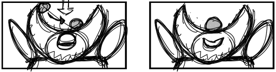
This is the only interaction between the two main antagonists of Jungle Book Shere Kan and Kaa.
At this point Kaa is about to eat the main character Mowgli, but before he can eat him Shere Kan asks where “The Man Cub” is, since he wants to be the one to kill him.
Both face off against each other intellectually to try and get what they want.
From the video given to us on Moodle, Shere Kan hears Kaa singing and tries to get his attention, thinking he may have ” The Man Cub” so he patiently waited my Kaa’s tale before pulling it like a bell. Showing his personality and attitude as sophisticated and intellectual within this situation.
Kaa’s expression to getting interrupted is being annoyed from being unable to eat Mowgli. he huffs and complains about having company, but immediately changes attitude to greet his guest. showing him to be two faced.
They both greet each other calmly and respectfully however with clear differences, Shere Kan gives off the noble and pompous attitude to the situation while Kaa seems to have a lade back, and conniving attitude while talking to each other.
Shere Kan makes the First move on taking advantage of intimidating Kaa by releasing his claws, while Kaa can clearly see and is surprised with this new threat of danger.
Even with this danger Kaa’s character is very deceiving and talks his foes into believing him. So he starts to lie about knowing where “The Man Cub” is trying to get Shere Kan to leave.
You notice there are a few “um’s” and “Ahh’s” used to show he’s making up excuses and reasons for why he doesn’t want to eat, sleep and has’t got time to think about “The Man Cub”
This scene really shows who’s in control of the situation.
Shere Kan first off isn’t buying anything Kaa is saying, he sarcastically nods his head in fake agreement and keeps Kaa at a lower level than himself, keeping him as the dominant predator.
Kaa then tries to use his strategy of mind controlling Shere Kan, this is to show that Kaa is trying to flip the script and become the dominant predator and tricking Shere Kan. Also notice that Kaa is trying to be on the same level as Shere Kan, trying to make himself on the same level as Shere Kan.
Shere Kan however isn’t dealing with that and pushed Kaa Back to the floor but lower, making Kaa seem even more less important than himself.
Shere Kan keeps looking up in the trees where he has the suspicion of Kaa holding someone with his body, thinking that he may have ”The man cub”.
Kaa then without thinking says “Search me” and tries to close his mouth knowing he caused more problems for himself as well as giving Shere Kan more power over the situation.
So as Kaa’s character has shown before he tries tricking Shere Kan again by only showing the front and back of his body, stopping his grip on “The Man Cub” from loosening as well as keeping Shere Kan busy.
That does not work however due to both hearing Mowgli Snore. This is shown with Shere Kan lifting his ear to the sky being able to get a better location of the sound. Kaa again tries to trick him by pretending it was him and it was to do with his Sinuses and his general unwellness.
Shere Kans reaction shows he doesn’t believe Kaa and still wants to check if he is lying to him. So he asks to see the middle. Kaa Accepted and Shere Kan getting annoyed with Kaa decides to check himself by grabbing Kaa’s body to see if he had eaten anything with no results.
With Shere Kan unable to get anything from Kaa he gives up but still believes that Kaa is lying, which is shown with a final look into the trees.
As a final farewell Shere Kan threatens Kaa once more and letting him know that he should tell him if he ever sees “The Man Cub” again.
Both these characters show character archetypes within there actions.
Shere Kan is clearly a Ruler Archetype, he is calm, powerful and intelligent. He has the ability to always be the strongest in physical strength as well as keep up with his intellect. He isn’t a good Ruler due to how he is willing to use threats and flexing his power to get what he wants.
While Kaa in my opinion would have the Sage Archetype, He’s smart and cunning as well as being knowledgeable about hypnosis and keeping people to his own will.
He’s also shown to be very deceitful and selfish which i think works well in the clip with him lying to Shere Kan.
So this was a fun project to create and finalise our very own characters based off certain archetypes used in many story’s and can be mixed and attributed together to create a satisfying character.
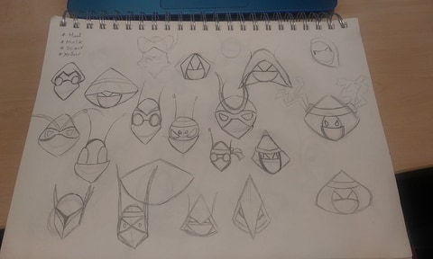
This was the first creations where we used a square, triangle and a circle to create different silhouettes. This would be used by taking a few of these silhouettes and change them into actual characters based on how the shape looks.
These are the two designs i decided to go for. I wanted to use them for the two archetypes Ruler and Rebel. Reason for these choices is because of how both of these archetypes work really well with each other.
I decided to focus on these two because they both seem well to rival each other. One being in power and being able to control while the other would more likely be a loner and wouldn’t be as powerful.
Personality wise id see the ruler as someone who would be to arrogant and proud of his own self, I also envision them as being lazy, selfish as well as self-absorbed that if anyone got any other attention they would be spiteful because of his own ego.
The Rebel however Id see someone who’s more closed off, keeps to himself but would jump at the chance to help others. But they still want to change the world and if something is wrong they want nothing more than to fight against what they believe is wrong.
The silhouettes are both very similar in design which really works well with contrasting each characters designs and personality. This would also show that both characters are not as different as you would assume.
Both these characters would play off really well since one would want to change the ruling while the other wishes to stay as the ruler and keep the power they have.
IDEAS
Ruler ideas
So these where my starting ideas for my Ruler character, when coming up with them i wanted him to be taller than my Rebel character to show him overshadowing the Rebel making them seem powerful and strong due to its size.
With these designs i realised i liked the idea of having my Ruler have something on its head or around its neck to show authority, such as a crown or a neck collar you’d find for old Victorian kings and queens.
For my ruler character i looked at characters such as the Queen of Hearts (Alice in Wonderland 1951) as well as Yzma (Emperor’s New Groove) Both look very different from one another but both show the Ruler archetype. Both Show power with handling there subjects with ruthlessness and unforgiving natures.
Both also don a big collar around there necks as well as some form of hat showing off there ruling presence.
Both thrive being the centre of attention as well as being the victor to any situation, power corrupts after all.
This is shown with queen of hearts always being the loudest and the most self absorbed character within Alice in Wonderland, always shouting, threatening people and cheats for her own self absorbed importance during a game of Croquet against Alice.
While Yzma is a natural born leader who tries and succeeds overthrowing the main character Kuzco. She constantly berates people she finds to be beneath her and gets rid of the people who fail her. She’s a born liar who will manipulate and scheme just so she can become more powerful and be the Empress.
With the knowledge that i wanted to have my character have a type of crown or neck piece i reworked my character. I liked the idea of having the character have some sort of helmet sometimes acting like a crown while other times acting like defence with having horns within the crown which i enjoyed having and wanted to use within my final Ruler.
After creating the Ruler having sharp horns for a helmet or crown i really got the sense of a beetle like design due to how the shapes of its horns remind me of my character, this got me thinking of making my characters more insect like since having that creepy and terrifying look is exactly what insects are able to do so well.
As well as the beetle insects i originally chose i also went with two evenly terrifying but majestic looking insects a black widow Spider and a praying Mantis.
All three of these insects are very recognisable as well as give of a very Ruler vibe, with Spiders being one of the most well known insects (or arachnids if you want to be more accurate) and spiders are the spawn of may peoples nightmares.
Praying mantis’s have that regal look, maybe its how its standing or maybe its due to its hand like pincers but they do give off a Royal look.
With my idea here I’ve really enjoyed my design of ruler near the end. i gave it a more thin look to appear more insect like, but i also added more mass near the solders to give off a more threatening vibe.
I really like the idea of having its crown just be massive pincers, makes the character appear more threatening as well as being able to show dominance due to its headpiece.
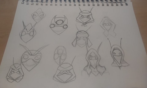
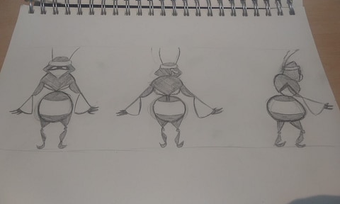
Rebel
So these were my starting drawings for my Rebel character. I really dont like how i started off creating this character. Reason for this is i felt that it became to brawly and muscly, when i want my Rebel to be the counter opposite to my Ruler.
With this new info i decided to reinvent what my Rebel was going to be.
I made a list explaining what i needed this Rebel to be to fully be my rulers counter opposite.
Such things like since my ruler is going to be tall and thin, making my Rebel appear smaller and a bit more rounded in size.
Even with colour i want my Rebel to show off some type of colour compared to my Ruler which i want to keep to darker colours like blacks, greys, dark reds.
While for Rebel i was thinking colours like light reds, yellows, blues, three primary colours that are simple and would really bring out the character and make them more likeable.
Both these characters (Fievel and Coraline) share traits I am looking for within my Rebel character. Both want there lives to be more exciting and interesting, both having the adventurous attitudes. Both have bright colourful outfits so they can easily stand out within a crowd. Fievel with his blue hat and red coat and Coraline with her yellow coat and wellies. Both also have to deal and defeat opponents that are clearly stronger and powerful that them, but they manage to think of a way to beat them through other means than physical strength.
The insects i wanted to use as a Rebel had to have colourful looks. Which is why i settled on a butterfly, a ladybug and ether a wasp or Bee designs.
Reasons for this are there beautiful colours and patterns, these would make wonderful looking characters if i use similar designs for my character plus giving them that standout type of colours would make them more noticeable than my Ruler.
Also since bright colours in nature normally signal danger, maybe ill have my character have some form of power over Ruler such as speed, power of flight, is it smarter than Ruler or any number of reasons.
All the insects I’ve chosen also have the appearance of cute and or nonthreatening, maybe its because they dont have horns or share much insect like features, with the butterfly wings looking beautiful to the ladybug not being that threatening and how a bee is actually furry and not like an insect at all really.
After coming up with the general idea of my Rebel being smaller but more colourful i set off on creating a more bug like design.
I started to really go for the Ladybug ascetic, no idea if its because i really liked the polka dot design or how the wings sort of open up to reveal the inner wings before they fly off.
So i kept experimenting with these designs, and how to use the wings within the work.
Maybe i wanted them as a poncho or a bag on its back, maybe just a blanket it raps itself up in. I realised i really wanted to have the pattern on both the front and the back of this character, i try’d bringing the wings forward more, but that didn’t look right, i tried rapping them round my character like a scarf still felt off, Or even having the wings open to show more of the red colour to the front. none really suited what i was aiming for though.
IDEAS PART 2
In the second week we went into designing our characters through means of Collage, Paints, ink, photos and other styles other than just digital or pencil.
I enjoyed experimenting and really liked trying out different textures for my final characters to have than to just stick to what i am use to.
When designing my characters again i realised that i had to focus on what colours i wanted them to be. For instance, if Ruler was to bright they would have come off not as evil as i envisioned them but more neutral or kind looking. With this i knew i wanted Black to be a centre point to Ruler, “Black is associated with Power, elegance, Formality, Death, Evil and mystery” I wanted to show that my Ruler is evil and black suited the need for my character.
I also wished for my character to gain a second colour of red, why red? Because “Red is the color of fire and blood, so it is associated with energy, war, danger, strength, power”
With this mixed with my idea for Black i think compliments both colours perfectly for my final colour scheme for my Ruler.
Id also like to link this back to my research with insects and how this is used with Black Widow spiders. Since Black widows have the distinctive red pattern down its back.
Plus Spiders are known to be one of the most well known “evil” types of creatures in story’s, examples could be Aragog from Harry Potter: Chamber of Secrets or Shelob from Lord of the Rings. Both are giant towering Spiders that course problems for the main character.
With this idea in mind for my Rebel i wanted to see if changing its design from a Ladybug design to more of a bee/Wasp design, reasons for this are that i wanted to make my Rebel more colourful than my Ruler and if both characters were Red and Black it could get confusing who was who and i wanted to keep both different but still seem related in the same world.
With this in mind i thought of having the Rebels colours be Red and Yellow. Light Reds are good for showing Determination, Passion, Desire and Love while Yellow is the colour of sunshine, joy, happiness and energy.
but after more experimentation i was interested in the blues and yellows more than reds and yellows. this could be due to Blues and yellows being complimentary colours.
Blues are used to show, depth and stability. It also symbolises trust, loyalty, wisdom, confidence, intelligence. But i wanted to go with more Dark Blues over all, this would be able to give the yellows in the design a needed boost as well as the Links Dark Blues have to being related to show knowledge, power, integrity, and seriousness.
When the class were discussing our work, people mentioned with my Rebel designs that there could be multiple versions of these characters running around, living together while my Ruler was used as a giant monster within this town.
I really liked the idea of having multiple versions of these characters but i also would have to create a lot of them and as much as that idea would be amazing to do. i dont think i would have the time and patience to create and animate all these characters. But nonetheless i love the idea of having multiple Rebels running around, but i think ill continue sticking to just one.
I was also interested in if i wanted certain textures to be used within my characters. Things like, having burnt marks on my Ruler or off coloured areas to show age or have my Rebel have fur or soft looking textures to make it appear more friendly compared to Ruler.
Ideas 3
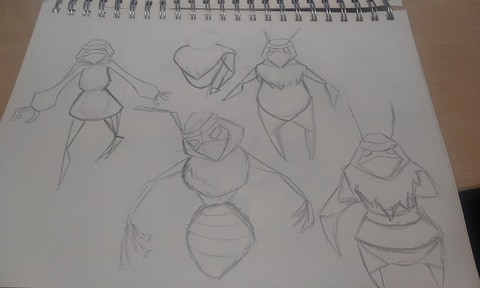
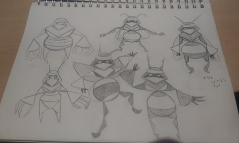
Now it was time to come up with the final looks for my characters. I will be looking for an insect like designs for both since insects have that creepy and grotesque sort of appearance that id really want to push.
Starting off with Ruler i really loved the spiked crown like head. so i played around with its thickness and figuring out about how the arms and legs would look like, since i wanted them to look like insect parts, such as having multiple legs like spiders or having the arms and legs as spikes instead of humanistic arms and legs.
I also experimented with having patterns along the body and being coloured in a reddish colour to show off danger.
This was my final idea. I wanted Ruler to be big and threatening, so i gave him a massive top half, showing its strength and power. I also decided for its arms to have armed weapons that would detract past its hands while in combat but then retract and be able to use its hands to pick up items. Its legs i thought of having them as massive thick legs with pointed bottoms, so its able to carry its own body, but at the same time still appear insect like.
With Rebel i wanted to ensure its face was concealed, so you wouldn’t be able to know what exactly its face was which hides its appearance and keeps its true nature ambiguous. After experimenting with the design i really liked having the bee/wasp design imprinted on a jacket/coat which really helped simplify the hiding the face want i was going for. I also thought about giving the character a backpack to be able to carry items or keep its weapons freeing its arms to be able to move without having to worry about items.
Here was the final design for Rebel. I really liked this design from the backpack to the really simple looking design and the jackets design mixed with the design a bee and wasp would have really brings this design together. Its both cute and simple which to me still has enough insect like design to it with its more human items used within it to bring the design further.
After finishing my design for Rebel i was unsatisfied after looking back on my ruler character. To me it looked to bulky and to insect like to really suit being in the same universe as my Rebel. So i decided to look into human items that would suit a Ruler character.
My first redesign was to see if adding a back like cape to my character to make it appear more fancy. I then though about the feathery scarf used by fancy women which would rap around there arms and along there back. that would be incorporated into my work as a sort of cape design.
I was still unhappy with the legs but once designing i was interested in a dress idea, So i wanted to explore that.
As you can also see i changed Rulers Eyes from two to one. I decided that this would make the character stand out more due to it appearing more disturbing and less human, as well as making it look less cute and more intimidating due to its lack of humanistic features
After coming up with a few designs with my Ruler wearing a dress i soon discarded the idea of having my character wear one. The reason for this was how even with the benefit of not having to deal with animating the leg movements i feel that it would be difficult for my character to actually be able to use it without having the dress get caught on its feet or being in the way with movements.
For this idea i decided i still wanted some thing to be done to Rulers lower half other than just its legs. That is when i landed on the idea to use elements from a Waiter and butler uniform together for my Ruler. A Waiter/ Butler are seen as posh and proper and used for noblemen and women, so having these ideas merge with Ruler seemed like a suitable fit. The final design for Ruler appears like he is wearing a coat which makes him appear prim and proper but with its insect like appearance still being used brings a juxtaposed look to the design but i feel makes the design fall together fluently and is a welcomed contrast.
Class show and tell + character discussion
After showing everyone my two characters i was given the critique that my Rebel design looked to innocent and less Rebel like than what it could have been. This was an interesting input that i wanted to amend but still keep the design ideas i really enjoyed relevant within my new retake on Rebel.
First off i wanted to make sure i kept the hoodie idea as well as the shape of the hood being with its triangle/ diamond appearance.
One idea i wanted to go with was adding a mask, having that added amount of secrecy as well as having the eyes appear constantly angry gives off more of a stand offish and threatening design which was a quick departure from my first idea.
I also thought about giving my character a scarf, since in my original sketches i designed a similar idea which i almost used. I wanted to have the Scarf come off as more like a cape which i wanted to mess around with.
I then messed around other ideas like increasing the eye sizes to make the design simpler having it overlap with the mask. As well as seeing if i wanted my design to have anything on its back or shown on its front like straps where he could put items or something smaller than a backpack.
I also liked the idea of using Bee Cone designs within my character which could be seen on its lower arms and lower belly.
Also wanted to mess with the scarf design to see if having it torn or messy would help it appear more used and worn in.
After creating this version of the character i realised i was creating more of a ninja type of character which was really interesting to explore. Ninjas are mysterious and cunning and i wanted to be able to keep that general idea alive within my Rebel but still stay within the ideas i liked in my previous work.
This was my new Rebel, its more threatening and more antagonistic compared to my original idea. The Added Honey cone designs on its arms and belly keep within the bee/Wasp aesthetic i wanted to stick too but still have a human quality within the design. The Scarf i think almost appear to look like wings which i think fit well with the design.
Moho work
After creating both my characters i started to create them with colour and create final looks for them to be used within Moho.
I wanted to try out Moho because its a software i knew nothing about and it was something i was interested in seeing the results.
This is Rulers full design now cleaner and with colour.
I decided to settle on a dark red to not take away the dark tones i wanted to go for my Ruler, i brightened the Black to almost a dark grey so you can notice the small details better.
Both colours i believe compliment each other nicely and both dont take full control over the design with a nice balance of colours.
This is Rebels full design now cleaner and with colour.
With its colour scheme i wanted to may them more colourful and brighter than Ruler.
I decided to settle on a yellow and Dark blueish/Purple.
I decided on these so Rebel would be able to stand out more than Ruler making Rebel appear to have more personality than Ruler due to the Darker colour scheme.
Here are the sizes i have settled with for my characters.
The reason for this was i wanted Ruler to be a towering and foreboding antagonist. Having it appear taller and more Insect like gives off a creepy factor to Ruler i feel makes the character stand out more as well as create a sense of unease towards the viewer.
The Rebel also with its colour scheme being different from Ruler, its size being small was also intentional.
Both are complete opposites both in colour and Size, but both still keep an insect like quality which i am happy with.
Moho thoughts
So after creating a rig for Ruler I started understanding more and more on how to actually use Moho better. It was a small disadvantage to work with a less than perfect version of Moho with it not being Pro, but I’m still happy with how i was able to work through that and create a pretty good Rig.
But after creating the Ruler rig i feel that i am not that interested in using Moho anymore. Its a pretty good Animation tool and i am glad i took the time to try it out. But i feel that with the designs i have created i dont think Moho would create the animations i am after. Hopefully in the future i can go back to Moho to explore how to use it further however.
Another Change
Again i decided i wasn’t happy with the end all design for Rebel.
After my first design which i was a fan of, and having to change the design i thought i liked my newer design.
Unfortunately the more i tried to use it the more problems i realised didn’t quite worked with the design. Its scarf for one was to big and having it flap behind the character the more i tried to use it didn’t work or look pleasant.
Another thing i feel pulled away the design was the colour scheme, the super yellow mixed with the dark purple was an eyesore, the colours were to contrasting and it was hard to look at the design.
I think with a darker hue to the yellow bringing it down to in brightness the look of the character would appear much nicer. There would also be a change the dark Purple and Blue colours i used, i want to change it to more of a contrasting colours that work well with Yellow, such as colours like Oranges, Reds and Greens.
I wanted to keep ideas from my past two designs that i liked, so things like the bee/wasp pattern and having the character have a hood and mask were items i really wanted to keep.
I settled on a diamond like hood design compared to the big triangle like design i used for my past two. This makes it look a lot more animation friendly honestly. Its more natural and i think suit the design more.
With the designs for the body i thought bring in more bee like quality, thought about adding wings at first which i thought seemed interesting to design. I desired to keep the triangle ideas for the arms and legs since that still keeping in the insect designs i am after.
I wanted to keep the bottom half as the biggest part of its body, to compleatly contrast from the Rulers upper Body design, to show how different the two characters are.
The final new design is a fine mix of both designs i believe.
Its simple and has a basic colour scheme like with my original idea.
And its got the essential equipment from the second design without making it appear to complex.
The colours i settled on is more of an orange hue than the blue/purple idea i had to begin with. As you can see the design stands out a lot more with its design and colour scheme.
I think having the colours appear more natural also has a good mix of nature than the Rulers more Stern and colourless scheme which could be linked to pollution or disease.
Story Boards
First thing to do first was to write up ideas i wanted.
Ideas about what the characters were like, how tall they’d be there personality’s and how they would move and interact with each other.
Ideas on where they’d be located and where the story would affect the environment they were in or if the environment affects the story for my characters.
Story idea 1
This slideshow requires JavaScript.
My first idea for my story was to have both characters fight over food.
It would have started with Rebels stomach growling while hes searching for food, then he notice a cherry out of no where. He goes up to see it and then Ruler hand comes to pick it up startling Rebel. Ruler then tries to drop the food into his mouth put Rebel fly and grabs it. leaving Ruler to try and grab the food before Rebel fly’s away.
Story idea 2
This slideshow requires JavaScript.
This story start with Ruler and Rebel being trapped inside a Can while its raining. Ruler being dominant asks for Rebel to get out of the can, Rebel refuses and the camera shows Rebel getting thrown out into the rain.
As Ruler is sleeping Rebel ties him up and as Ruler awakens its revealed that he’s been glued to the wall as Rebel enjoys a hot fire.
Story Idea 3
This slideshow requires JavaScript.
The idea for this one was having my character interact at a dinner party Ruler would try to act posh and sophisticated drinking correctly and eating right. While Rebel would act immature and slurp up his drink and chew loudly. This would result in each character trying to ruin things for each other. Ruler would slam him hand on the table having Rebel his drink on himself, while rebel would sling food at Ruler with his slingshot. until it ends with rebel flying and pouring water on Ruler and ruler flips the table.
Story idea 4
This slideshow requires JavaScript.
This idea had Ruler and Rebel fight over a flower. Ruler being bigger and stronger than Rebel picks him up and the flower, looks at both then tosses Rebel and then puts the flower on. Ruler starts to walk away before Rebel chases after him. He toss’s a stone at Ruler which results in ruler getting angry and looking around for who threw a stone at him. Rebel ask for the flower back before Ruler disagrees and kicks him away.
Rebel then fly’s past ruler and steals the flower with Ruler chancing after him.
What idea have i chosen?
What i was looking for was to be able to show off both Rebels and Rulers characters simply through camera angle and actions, since i wasn’t going to use dialog. So the story has to be simple enough that people get what is happening.
I have chosen to go with my Forth story idea because i really enjoyed the camera angles i was working with for this story and with the simple plot i think help keep the story grounded and easy to understand.
Finalised Story Board
Change from Thumbnail storyboard.
Instead of having the Rebel character come into a cave like area and look at the flower i found it better to just start with the character looking at the flower, this was to focus on the character before Ruler stands behind him. Also not revealing Ruler until after its shadow builds suspense and lets the audience wonder what does this character look like.
I also changed the idea of having Ruler walk away from the situation. I did this because i found it broke away from the conflict more and i wanted it to be more confrontational, which i why cutting out Ruler walking away and having Rebel try and gain his attention was replaced with having Rebel immediately get frustrated and cause conflict by using his slingshot.
I also took out a scene were Rebel would ask politely for the Flower back and have Ruler kick him away before Rebel would fly up at just take the flower.
I think this was the right move since it took away from Rebels character and having him be polite right after him just using a slingshot and getting upset with Ruler seemed out of character which i am glad i changed.
Why i chose those scenes and camera angles
Having the forced perspective on the Flower and Rebel was a cool idea, being able to push the flower to look bigger than Ruler to then reveal it to be not at all as Rebel make the flower become the most important part of the shot, having Rebel look at the flower exemplifies this by having him focus on the flower, which gives the flower power within the shot.
The second shot not only was used to show how small the flower actually was, but was to show how small Rebel was. From using the rule of thirds it makes Rebel seem small as well. Plus having such a negative space with nothing in it invites the idea that something will show up which makes the scene stronger since you’re now waiting for something to appear.
I really liked the idea of having the shadow first to introduce Ruler compared to just showing him outright. Reason for this is, having the shadow can show danger, show that their is this darkness looming over Rebel. I feel however to exemplify how small Rebel is i would push him even lower into a corner keeping with the Rule of Thirds and to really push the Shadow to show how massive Rulers presence is.
The shot with Rebel and Ruler in the centre of the frame really pushed how their size differences really well, Seeing the the camera push up to reveal more and more of Ruler while sticking to Rebels size really pushes the height differences between the two as well as keeping ruler as a looming threat.
With both these shots i wanted to mess with the fact that Ruler is massive compared to Rebel but still keep the shot interesting and keep the focus on both.
Going back to the same shot i mentioned earlier with having Rebel next to the Flower But this time with Ruler in the exact shot really show both, how Rebel is tiny and How Ruler towers over him.
With both shots i have shown they both show triangles in composition.
I believe this really helped push the idea of having Ruler come off as the most intimidating character when both were shown on screen together. and having Ruler be massive within the last shit while Rebel and the flower took small sidelines in the corners shows off Rulers Dominance within the Scene.
This scene was a fun inclusion. I liked the idea of using a characters design be used within a story organically. Having the idea of having a ball roll up and down Rulers head seems like a real fun comedic idea that i just had to incorporate it into my work.
This also helps keep the shot interesting and not be classed as a boring face shot as a lot of these shots could be.
Inspirations and things i enjoyed
Wander Over Yonder Season 1 Episode 27 The Void
I absolutely adore this show. Released on 16th August 2013 before ending in 27 June 2016 totalling 43 episodes for 2 seasons this show has some of the most amazing visuals put to screen through animation.
No better episode shows off its animation chops than this episode. where its just 2 characters interacting with each other with little to no backgrounds.
The reason why this is amazing to me is just how perfect the characters look and interact with one another, they’re both super distinguishable from each other which is easy for the viewer to pay attention to who’s who.
The camera angles are wonderful as well really pushes when a character is super small and pushes how exaggeratedly large the other character is.
This Bee flying Video was a good help in figuring out how to make Rebels flying scenes look like actual wings flapping. I also looked at other sources such as the Grasshoppers from Bugs Life due to how fluttery and bury there wings flap.
Music?
While i was busy at work animating my characters and getting them to work correctly, i was listening to music. This music was from a game called Crash Twinsanity, which was a part of my childhood i keep coming back to, why?, because of the music.
Unlike most games Twinsanity went with a fully a Capella soundtrack.
Whats a Capella? Its when theirs little to no actual instruments used in the music and is all preformed solely using mouths and your body parts.
This fascinated me so much that i really wanted to go full force with my animation and add my own a Capella into my animation, instead of just copy and pasting a free to use music onto my animation.
Some Crash Twinsanity music i love.
Unfortunately i was unable to add a proper a Capella due to my little knowledge about how to make one and how to properly sync and tune music together. This however just wants me to push further in future into learning more about music so i can eventually be able to create my own soundtracks as well as hopefully work with more experienced music creators so i can learn from them as well.
Animatic
The Animatic for me really pushes the timing and ideas i had within my storyboards. Even with my storyboards i changed a few ideas around. First thing is i added a beginning and an ending to my animation, i decided to add this after speaking to Owen about my story boards, he mentioned that there should be a more clear beginning to show a reason why Rebel looking at a flower would be classed as more Rebel like than just him being there. Which is why the idea of the location Rebel is in is actually Rulers property, also having Rebel graffiti Rulers sign and Fence seen at the beginning and ending adds to Rebels character than what i gave him in the storyboards.
I also wanted to change some scenes slightly, such as the scenes where Ruler terns to see Rebel having the camera follow Rulers gaze as well as putting the camera right in Rebels slingshot gives a much more dynamic shot that really made the scenes stand out more than what i did in the story boards.
I think the timing works out pretty well and its clear what is happening at any given time. Hopefully when i start to animate some of the scenes will look much less still and much more fluent than what is shown.
Backgrounds and other Items
These are some work i did to add a little life into the background of my animation to show off that this property belongs to Ruler and how Rebel would be trespassing.
Also i decided to merge the 2 signs i had in my animatic to just one since i think the flow would suit the mood better and having a cleaner version before Rebel comes and Ruins it seems more comedic moment.
My trees and bushes artwork were to be place around the animation to give off a more lively and Nature driven place. i may not be able to use all my designs but i am hoping to use as many as i deem worthy.
Animation
What i liked
With the finished animation i was super happy with how it turned out. I loved my animations of both Ruler and Rebel turning and really felt like they were living characters.
I am glad to be able to clearly see how far I have come since the start of Uni, My line work is a lot more clean as well as how i was able to actually add colour to my Animation which was something i really wanted to improve on from my Metamorphosis piece, which I am happy to say was a success.
Both characters are lovely coloured and are really distinguishable from one another and have really pronounced character designs. The story is easy to follow and has some slapstick within giving the story some comedic value while viewing.
What i would improve
As much of an improvement as this animation was compared to my last there are still things i wish to improve on and change with my completed work.
Firstly i feel that the backgrounds are very bare and barren. Adding more of a world and life within my world would make it stand out more and feel more lived in compared to my nothingness void i seem to have made.
I also feel that if one scene from my animation needs to be changed it would be the one after the flower is stolen from Ruler and he turns to see Rebel flying.
Having him turn as well as slide out of frame doesn’t sit well with me. I would if i could redo it ad a few more frames having the character look at were the flower was look back at where Rebel was before realising that he took the flower and have him turn before quickly changing the camera to Rebel. i feel that would be a much better scene if that was done.
I also feel that after re watching the animation that i should have added a bounce or two when the rock hits Rulers head before it started to roll.
I also feel that with the music and background sound i used i wish i had more time to use the recording studio to be able to use and create my own sounds.
I really loved the idea of creating them as well as making an acapella to company my animation. As much as i feel the song i ended up using was sufficient i feel that it was a cop out.
What would i like to do going forward
After this brief i feel that my next big step would be to manage Lip syncing. I haven’t yet tackled that obstacle yet and i really want to see if i can push my animation capability.
Id also like to dive into more of a narrative maybe try out script writing and even more character designing.
Creating worlds and working more on backgrounds also to me seem like something id like to improve on and stop having the characters run around in a void and create liveable or recognisable areas.


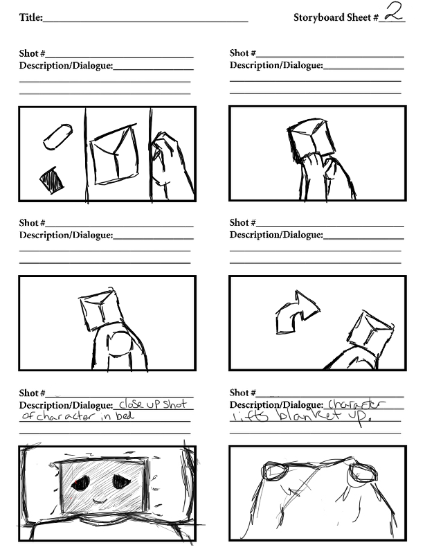
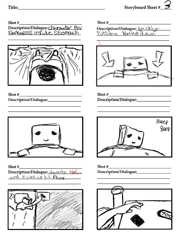
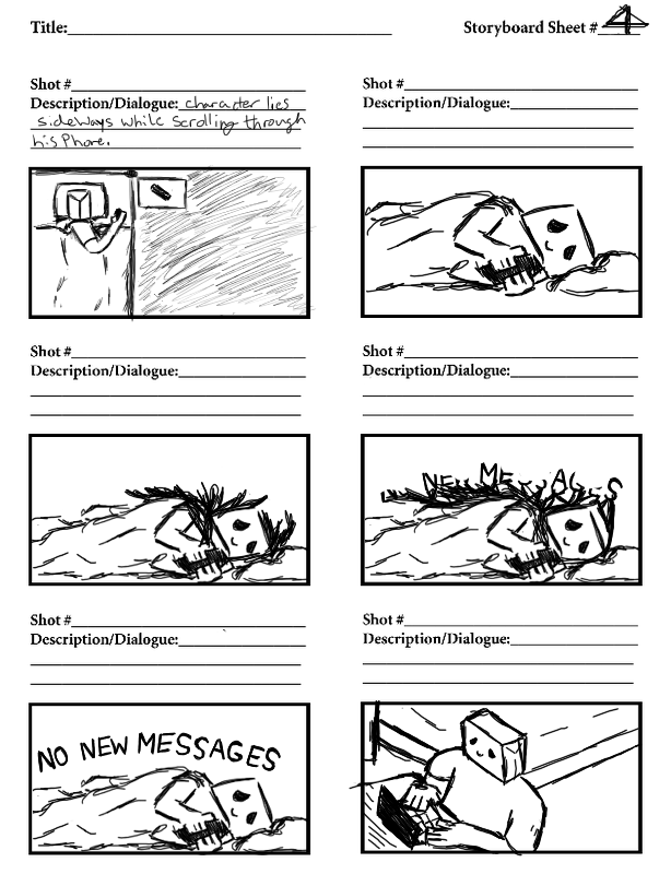
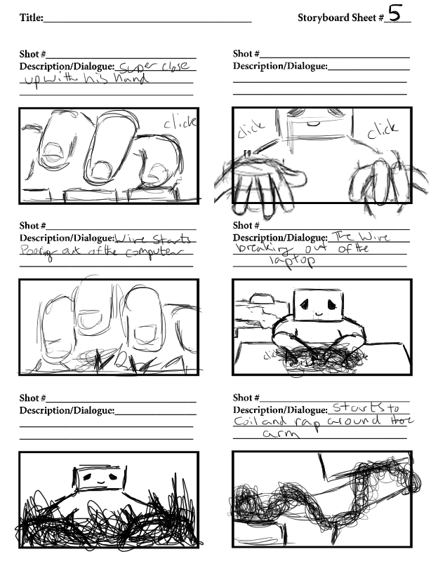
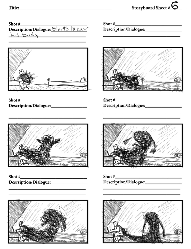
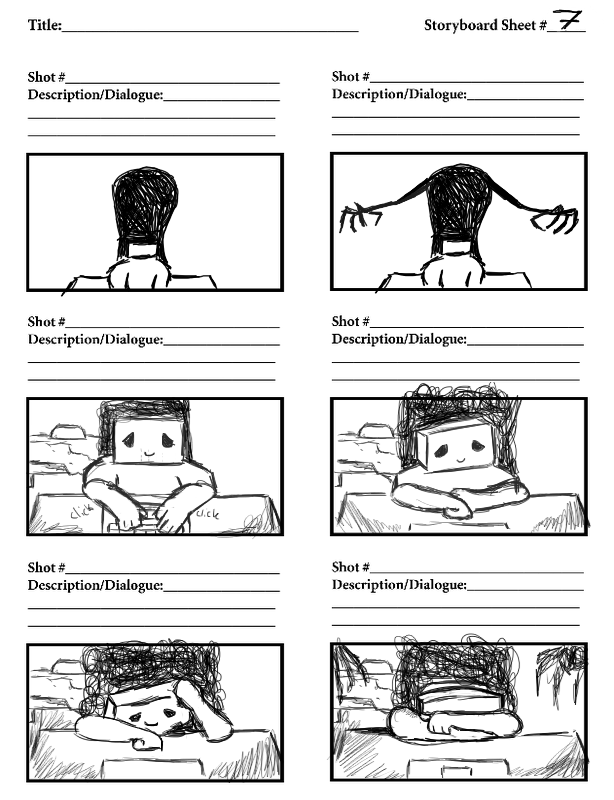
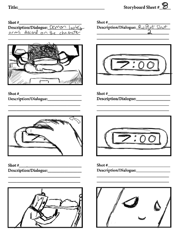
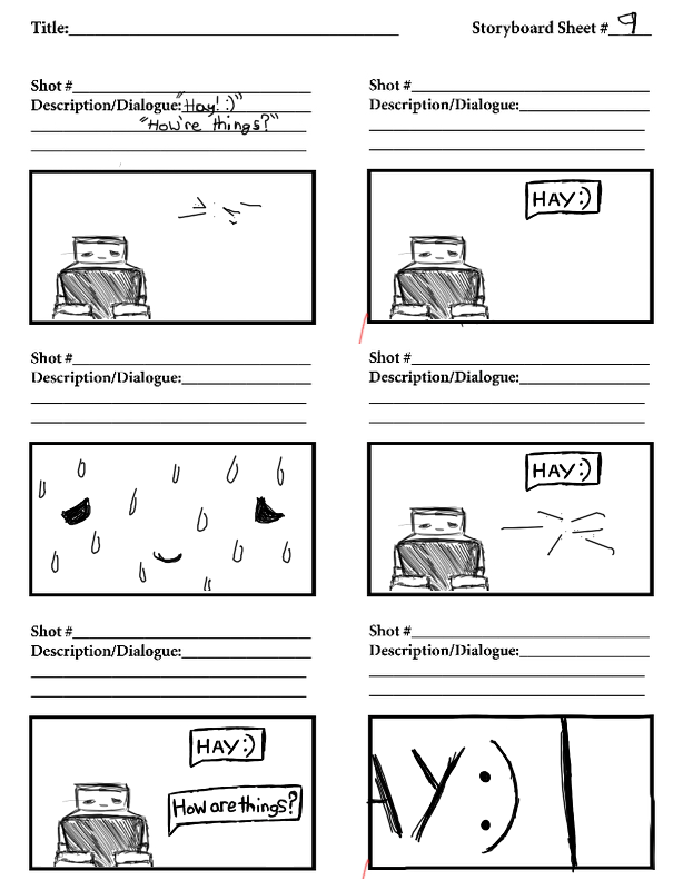
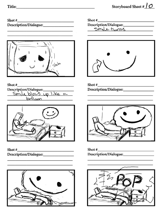
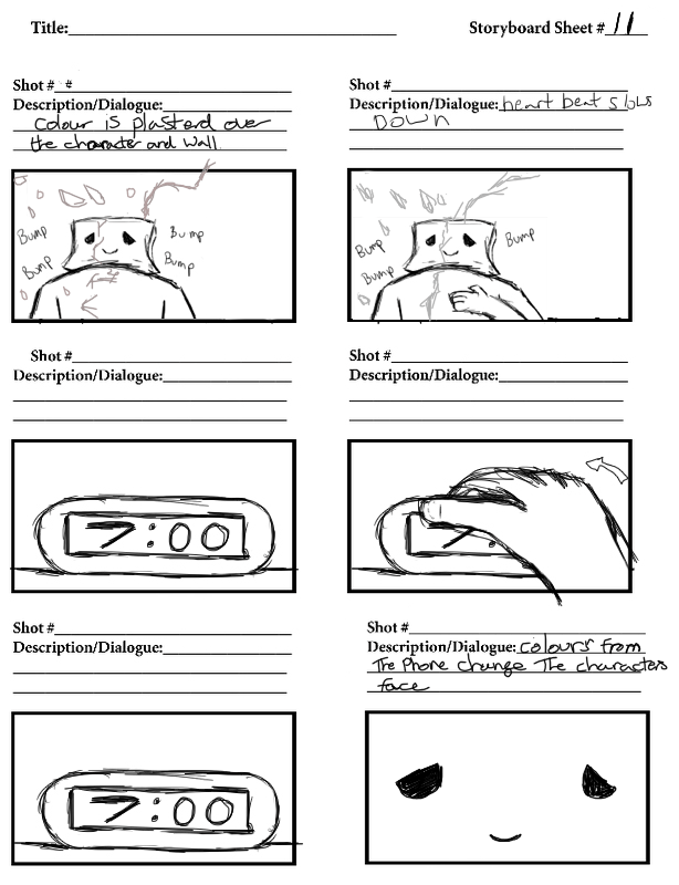
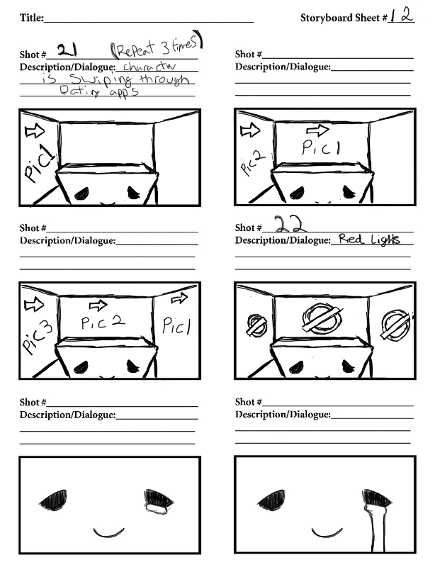
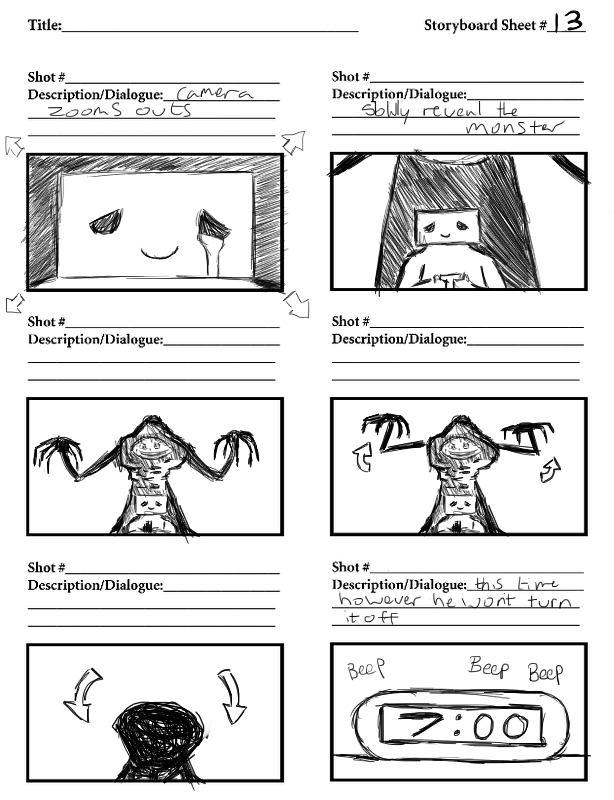
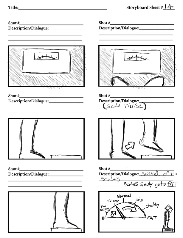
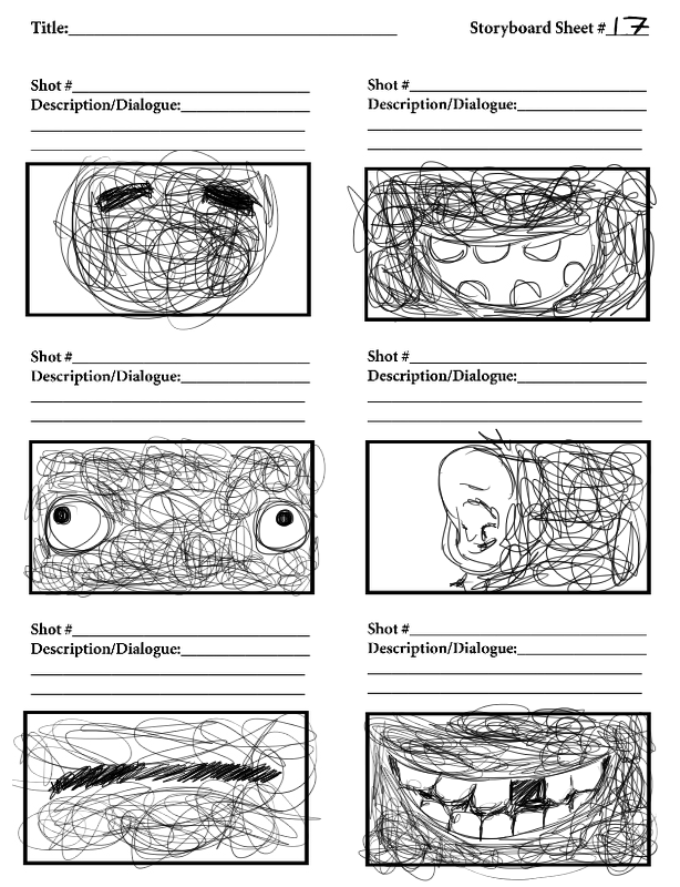
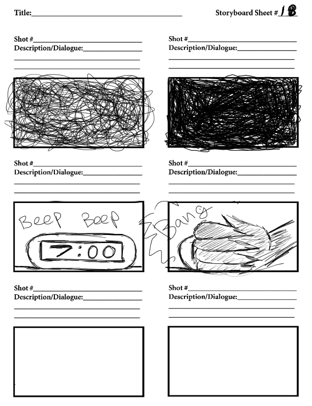
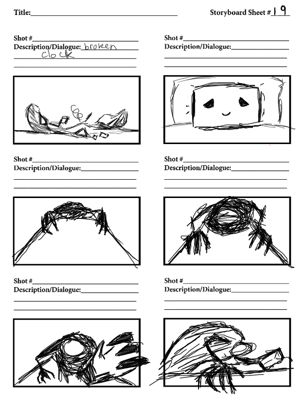
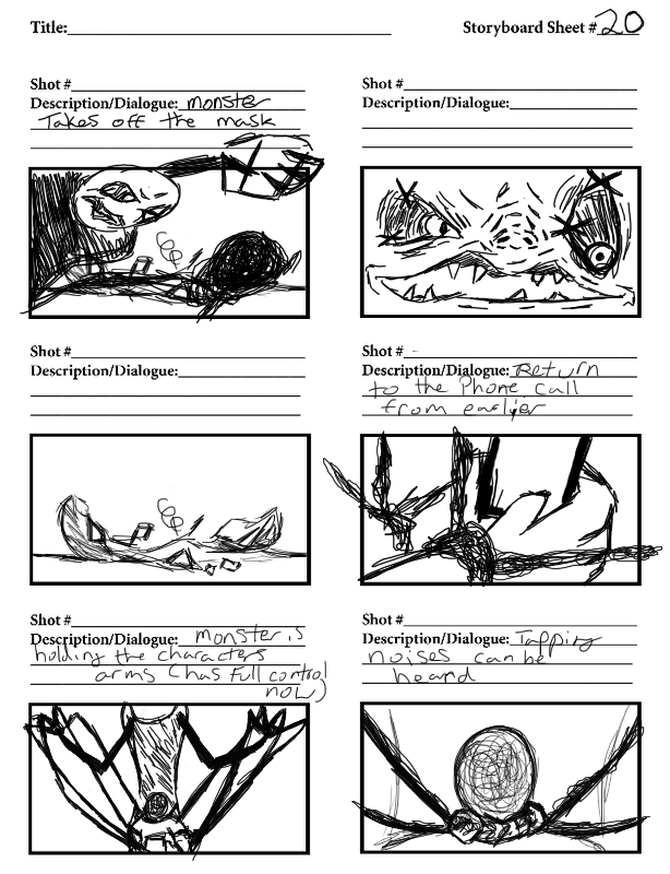
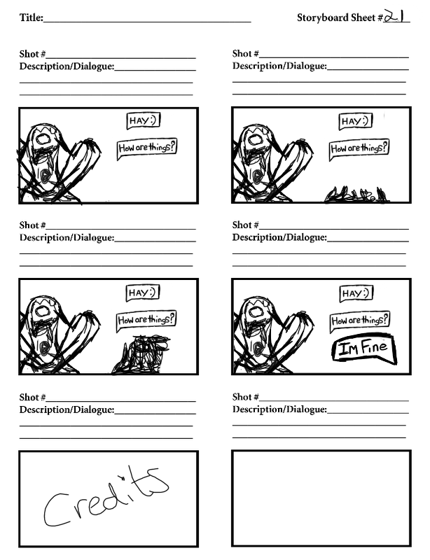


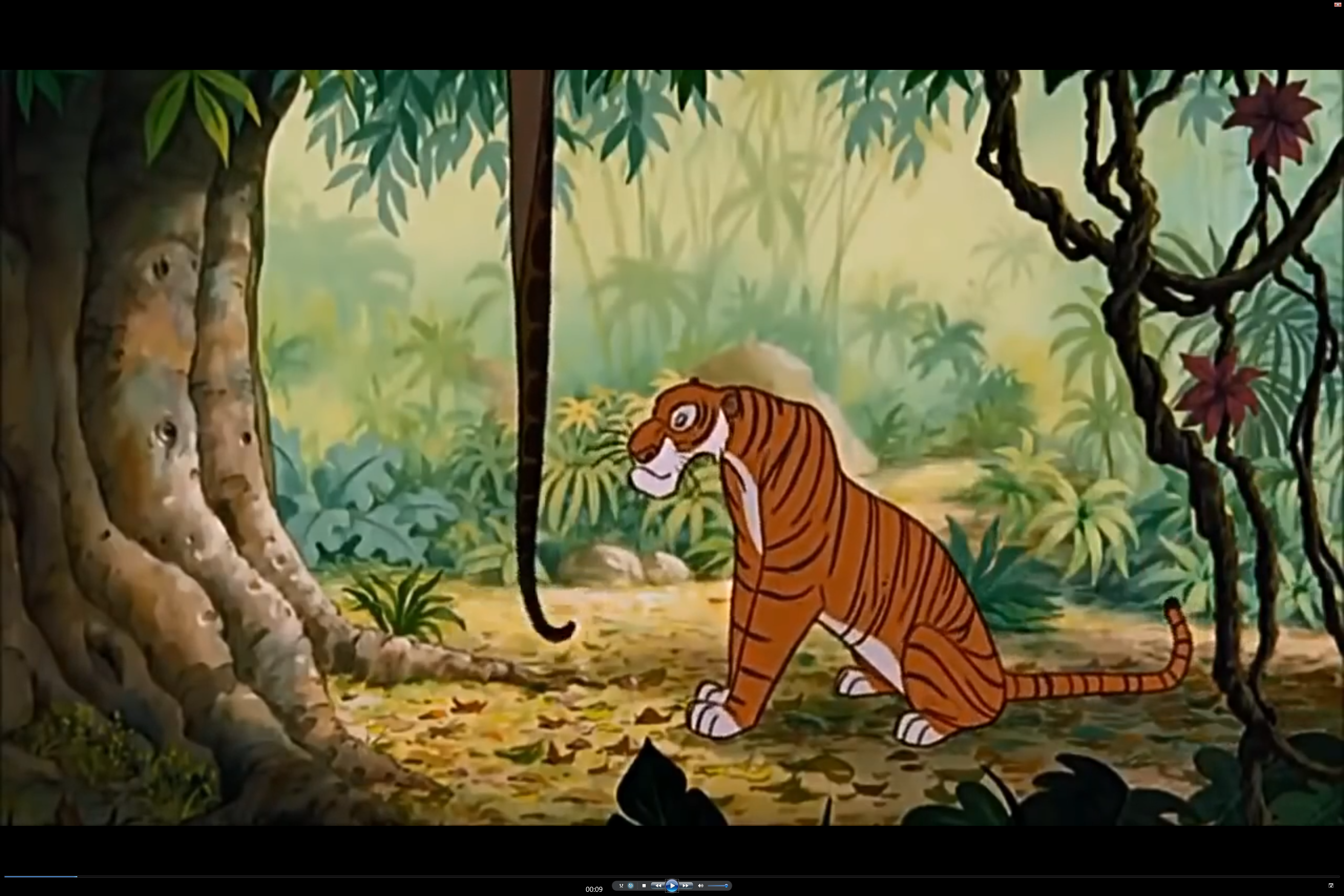
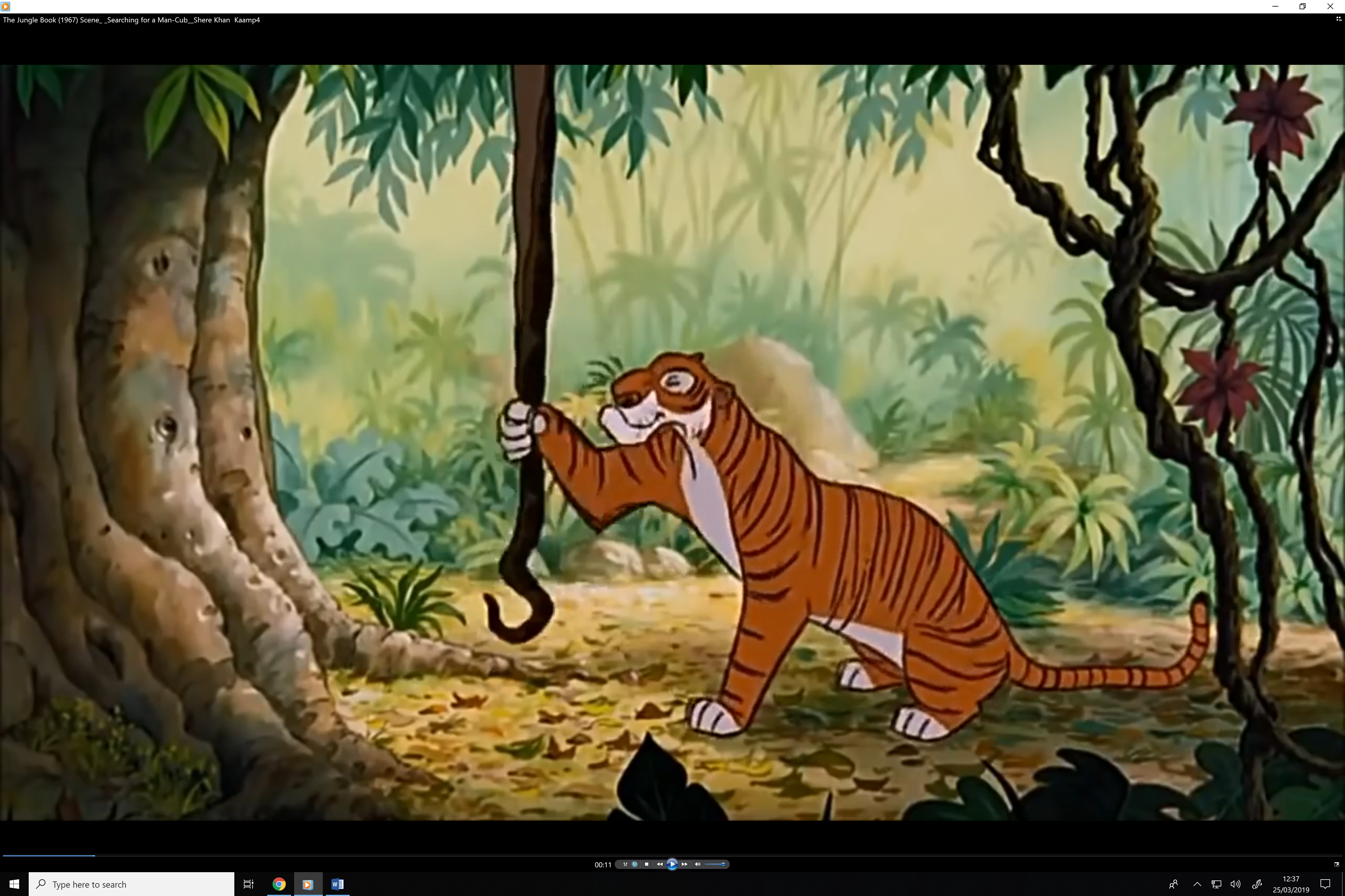
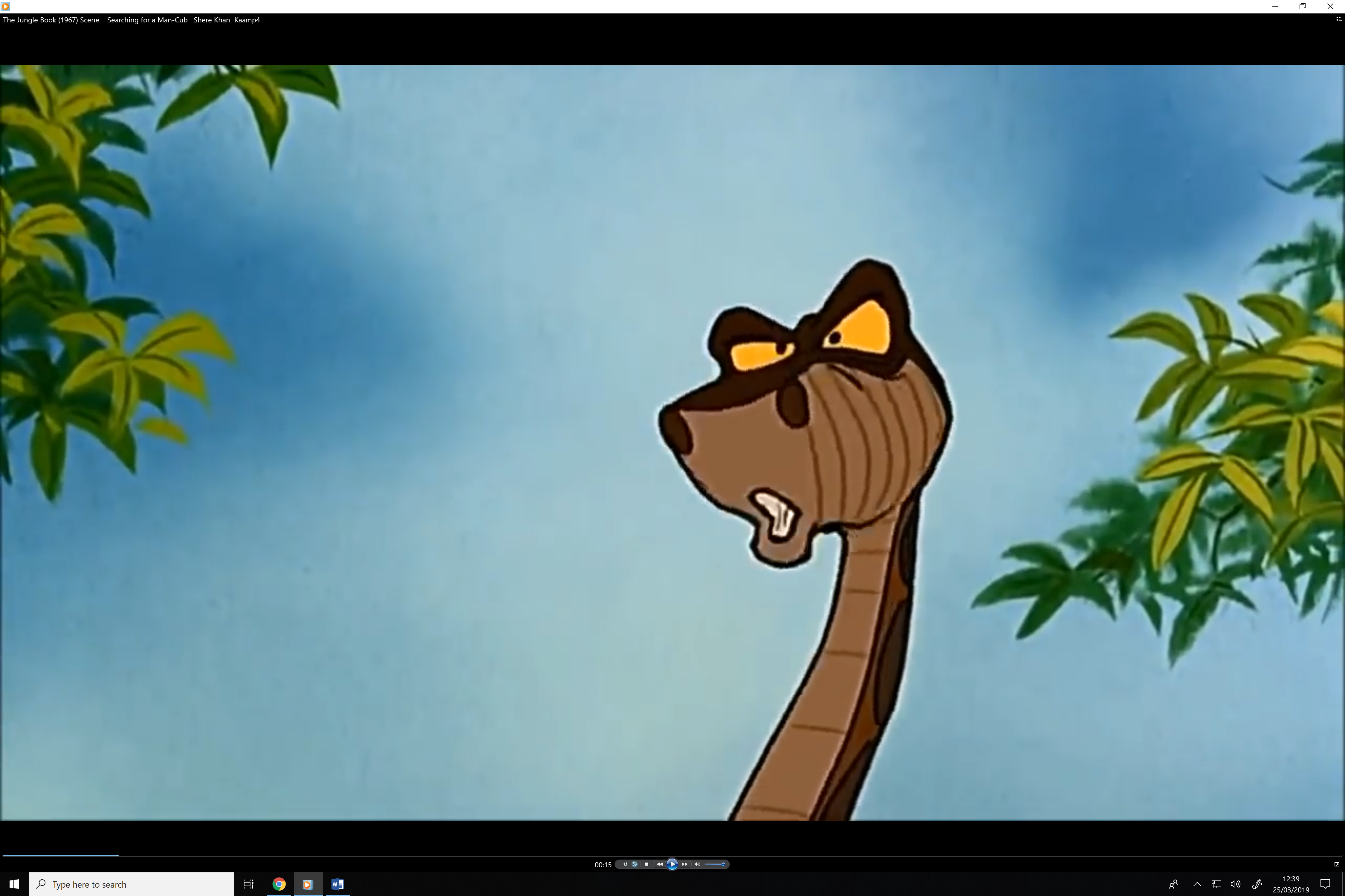
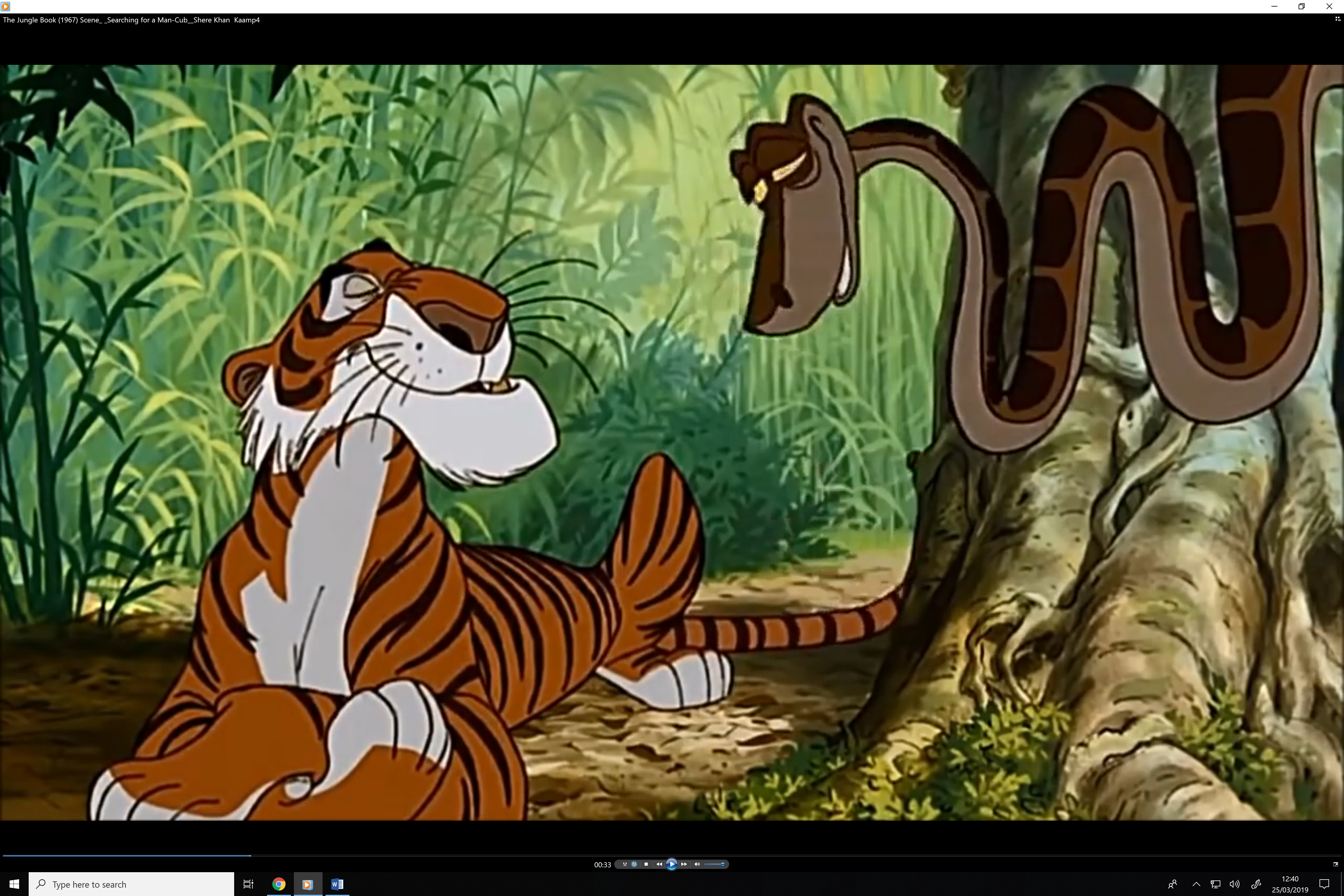
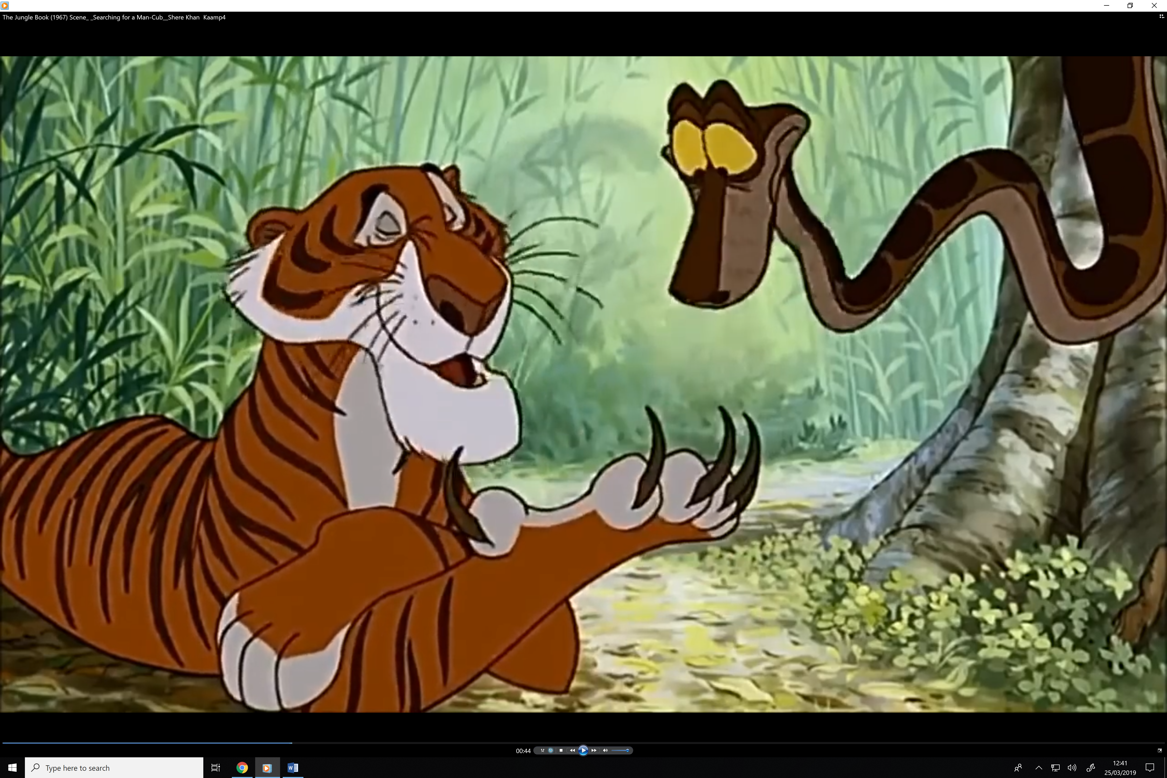
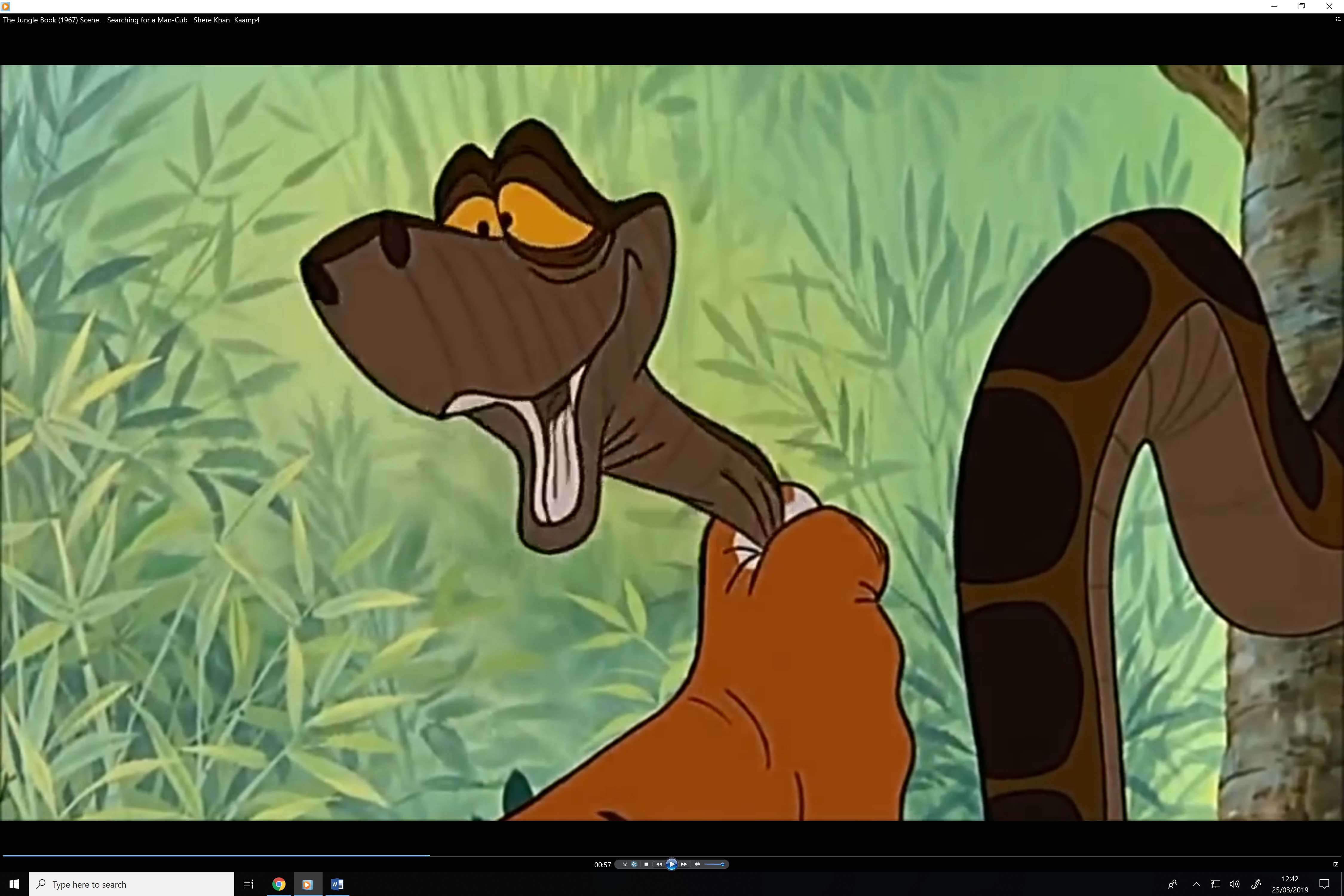
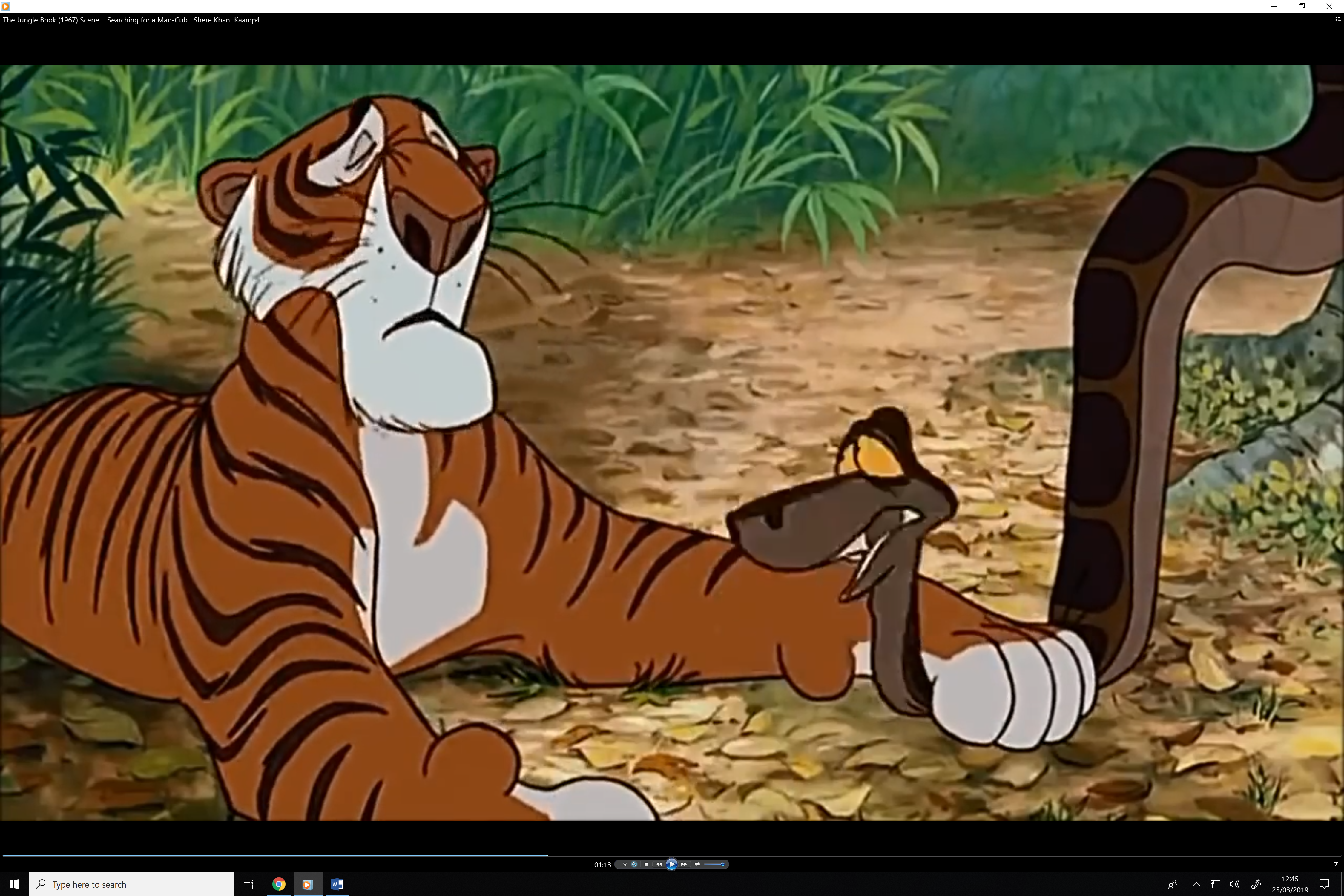
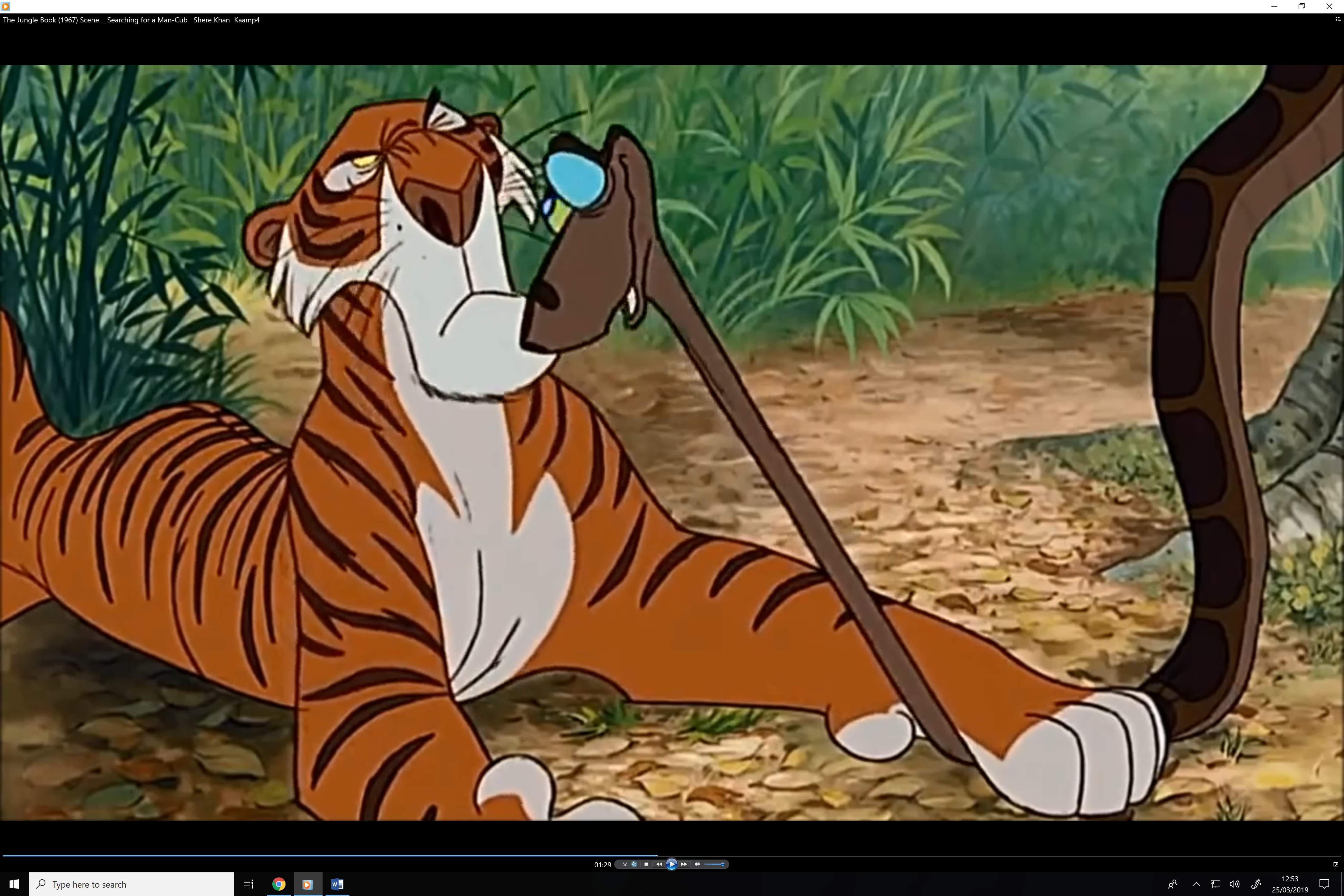
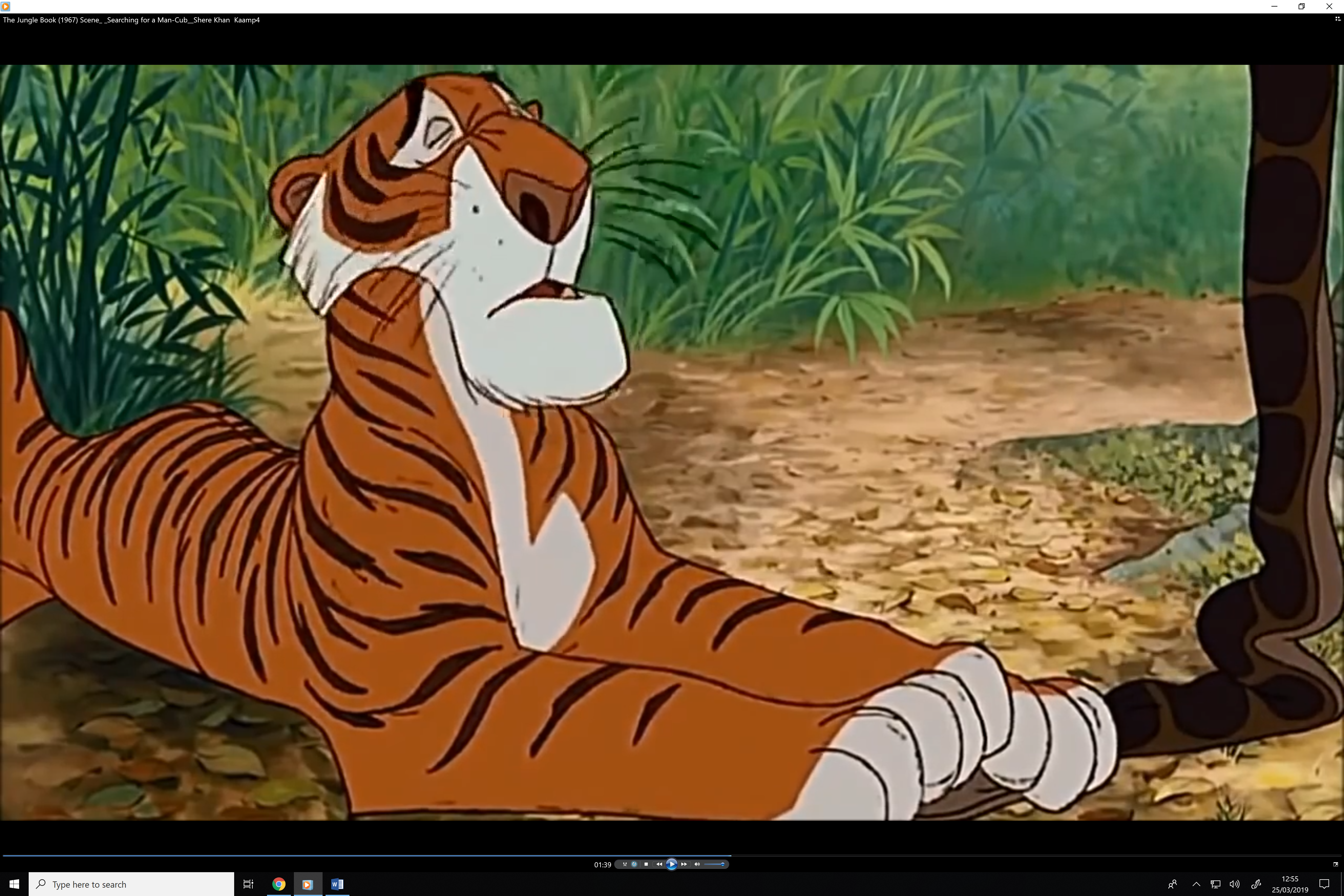
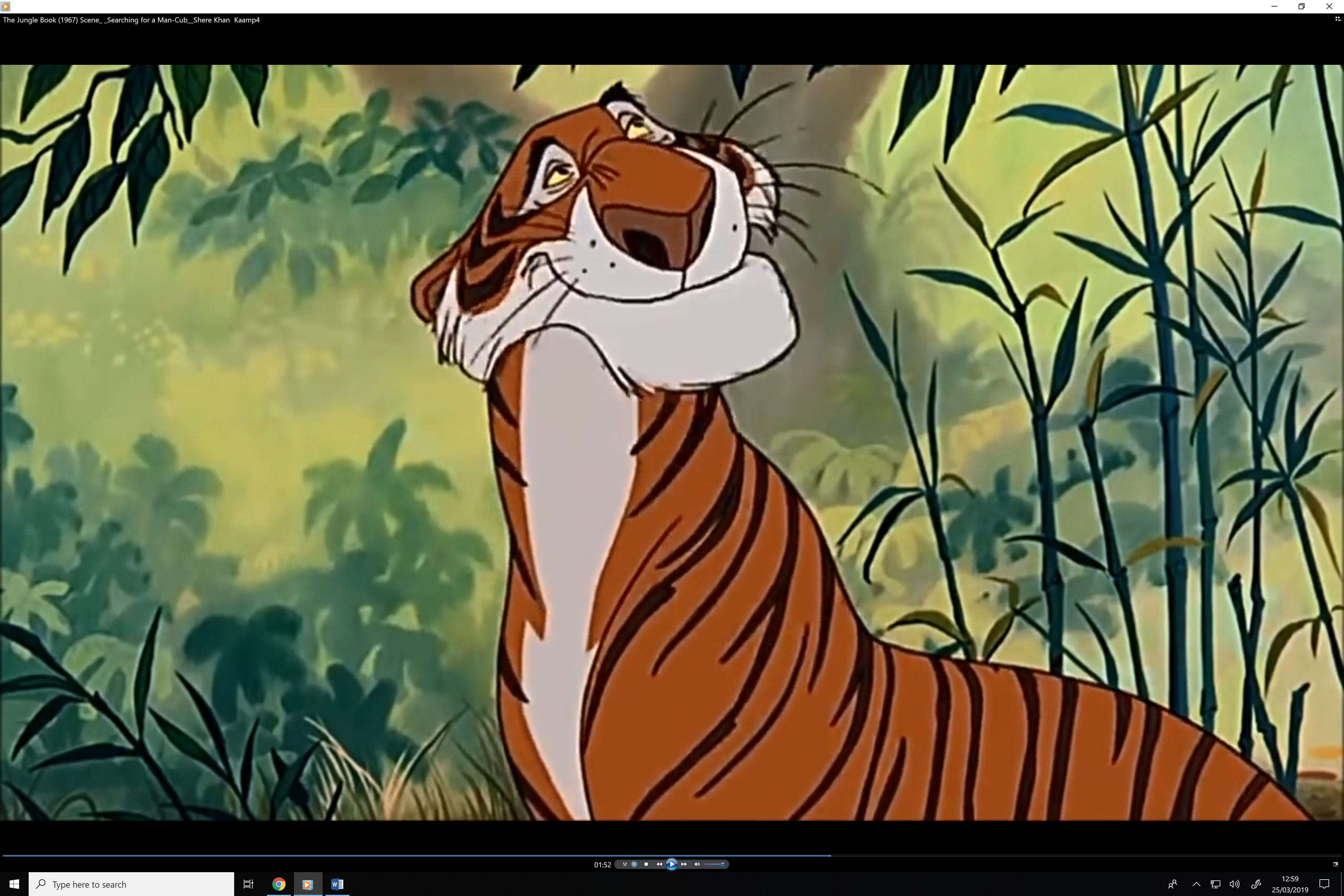
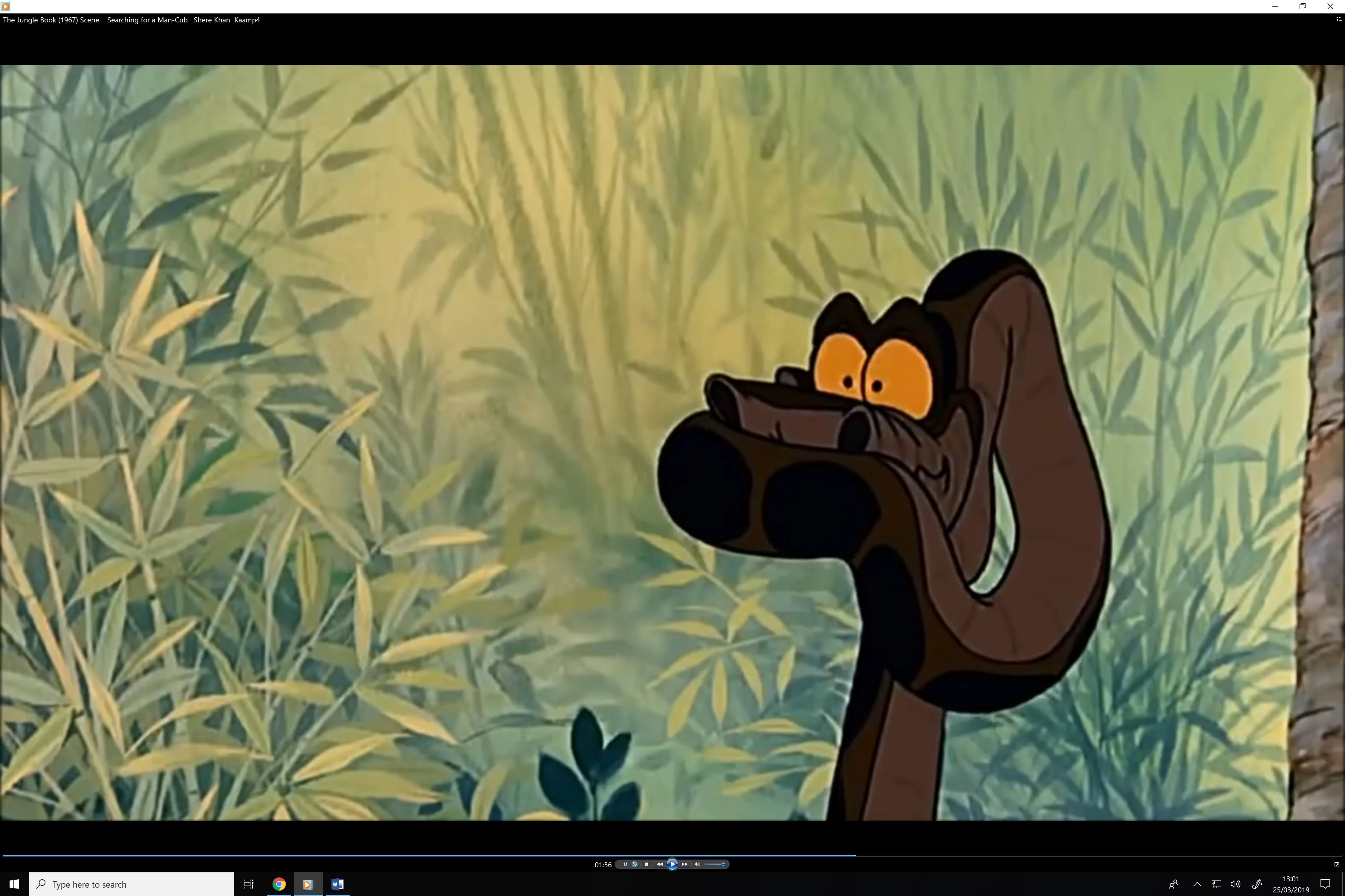


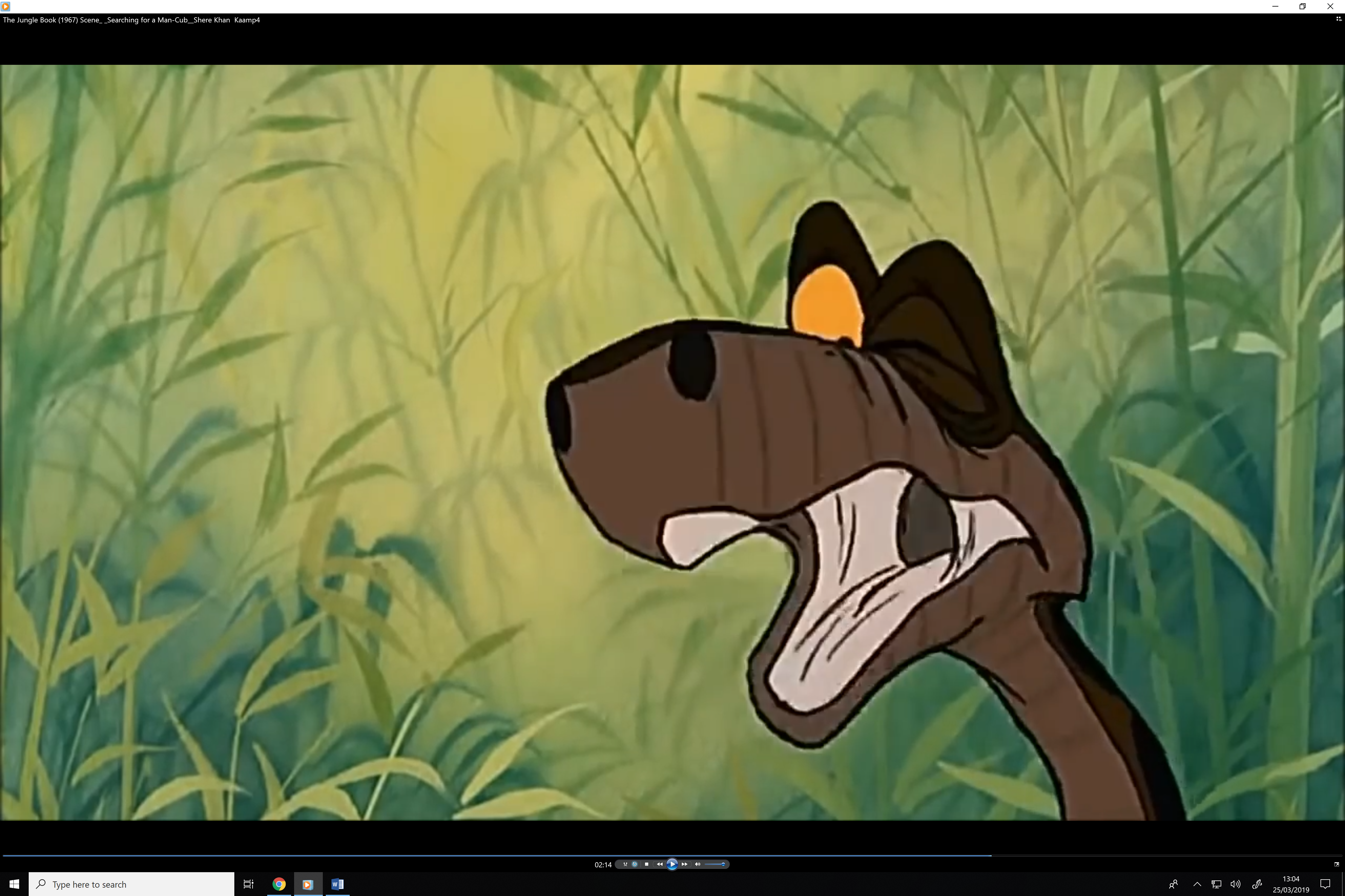
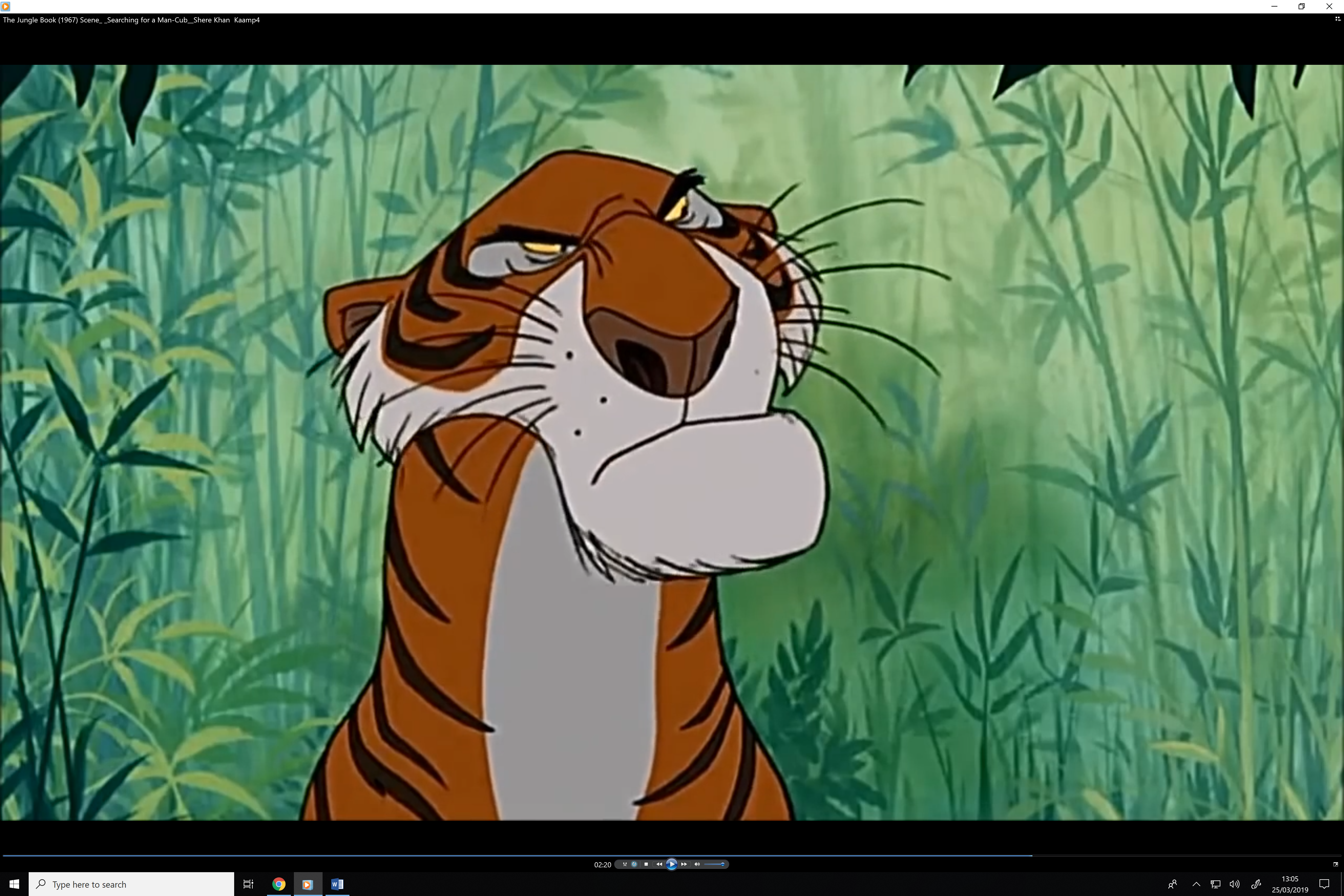
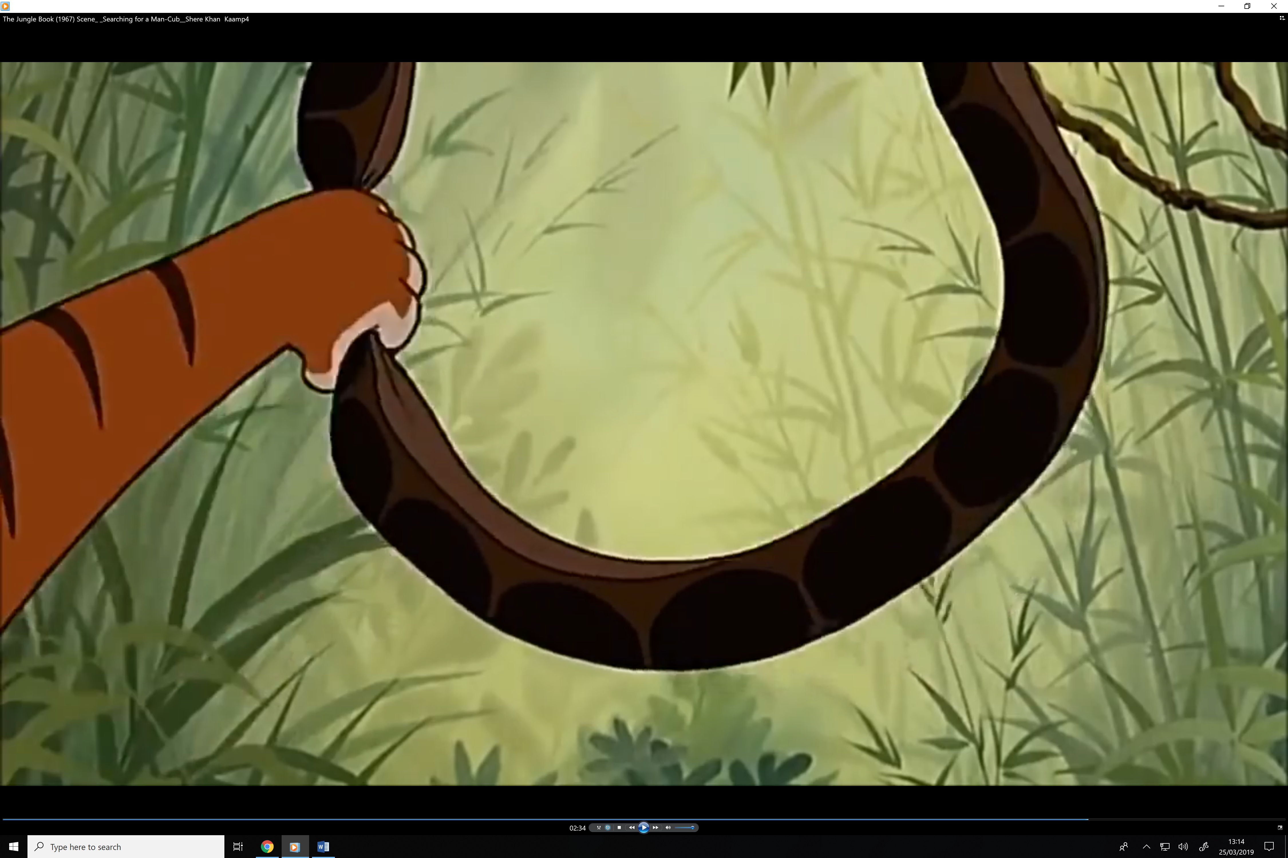
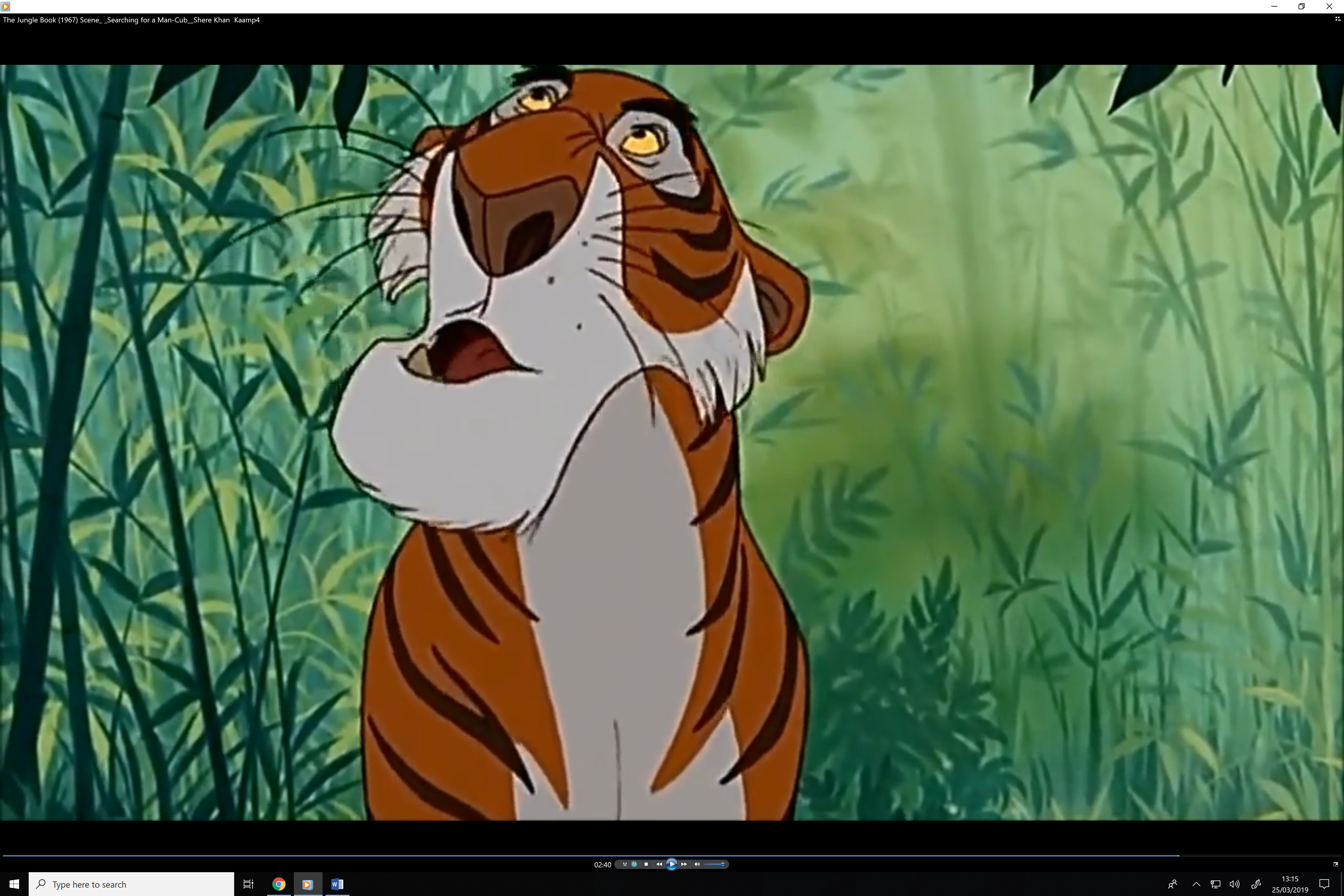
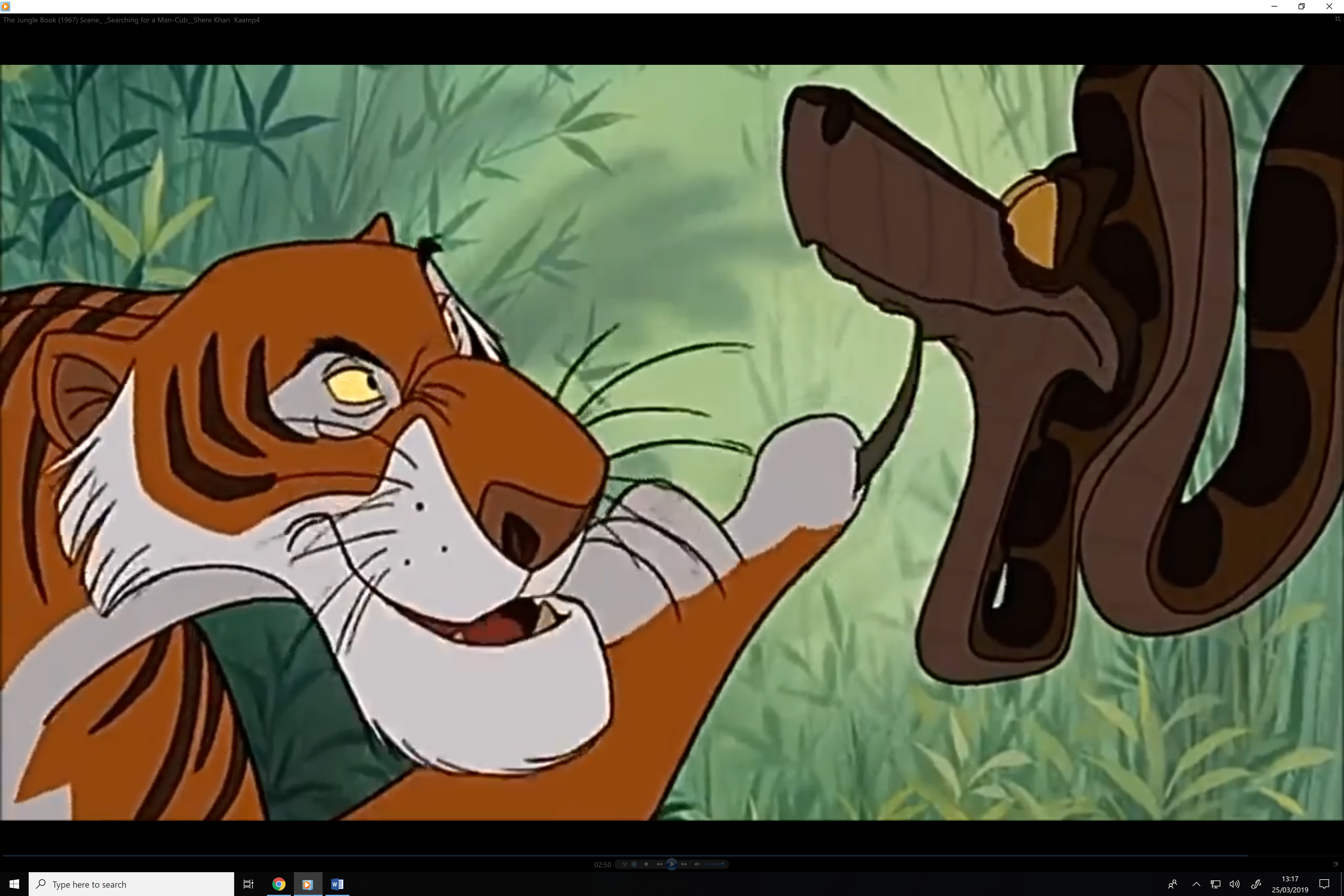
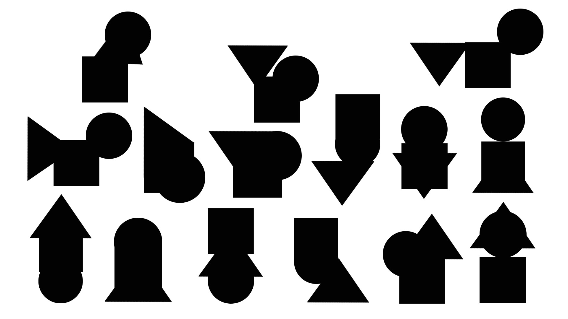 This was the first creations where we used a square, triangle and a circle to create different silhouettes. This would be used by taking a few of these silhouettes and change them into actual characters based on how the shape looks.


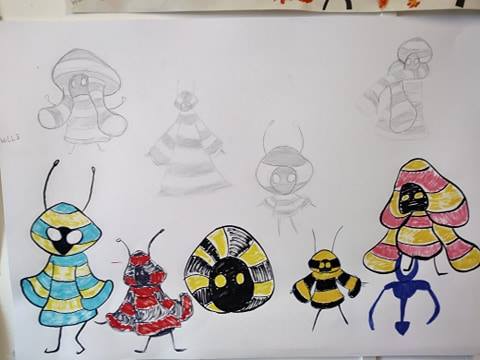

")
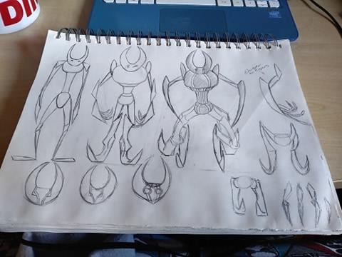
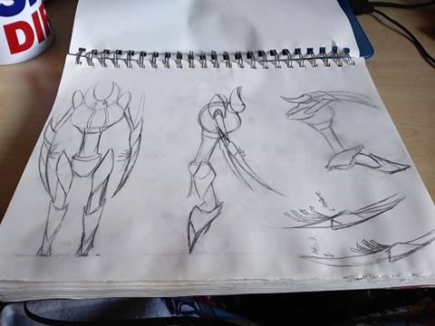
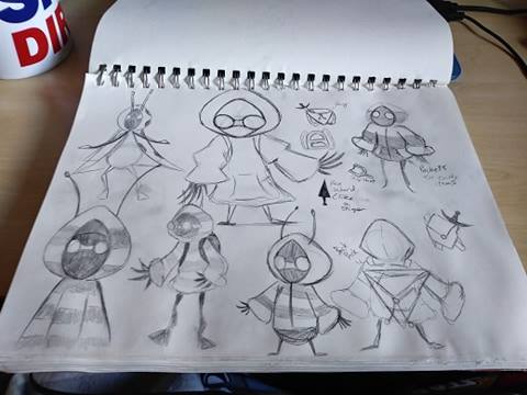
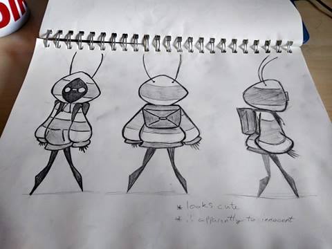


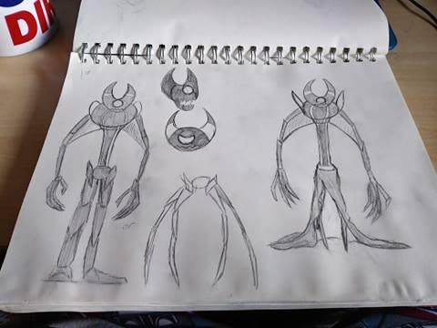
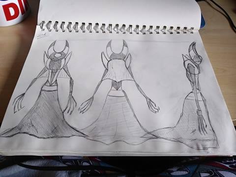


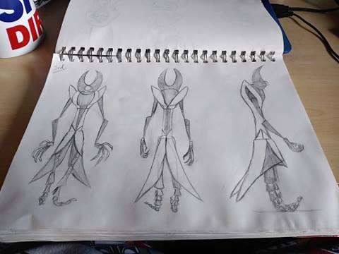
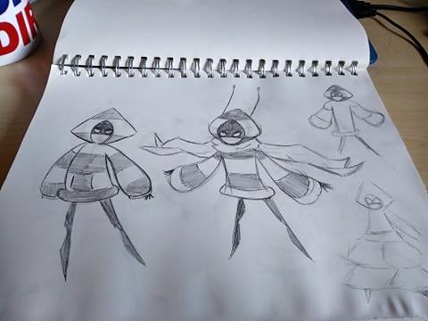

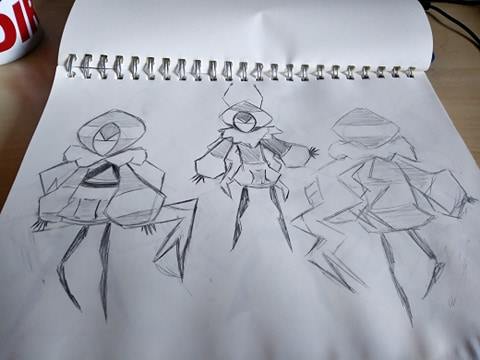


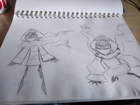
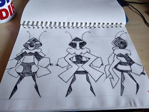
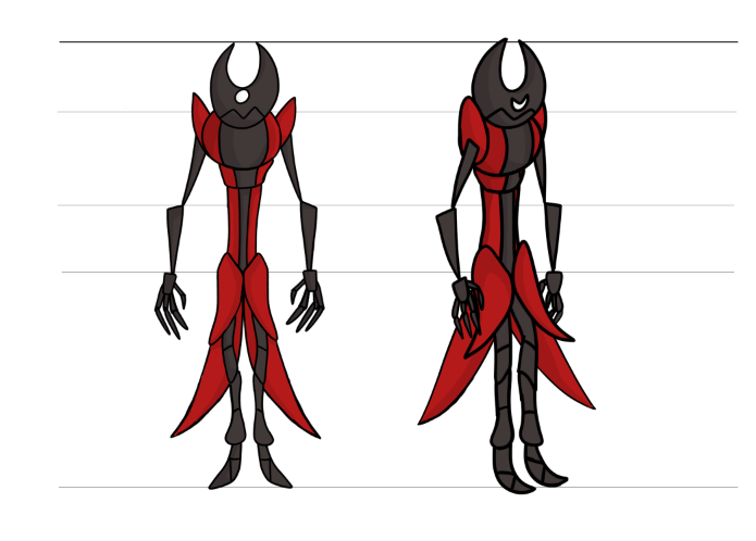
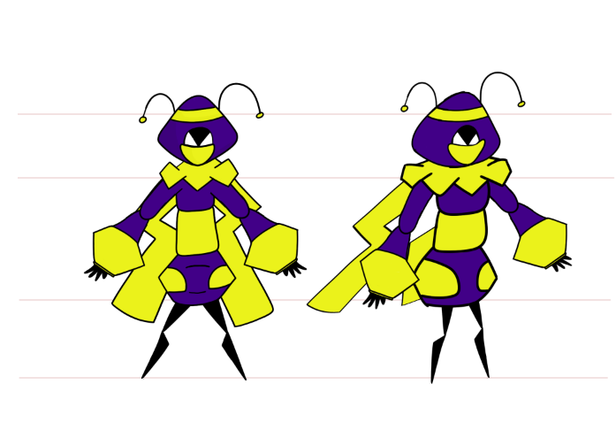 This is Rebels full design now cleaner and with colour.